REDESIGNING SAAS PLATFORM
A website builder SAAS platform focused on providing small businesses with an easy low-cost way to get online and get internet presence. UENI delivers a fully built website and listings on trusted high traffic platforms with without involvement from the customers and with very low cost.
THE CHALLENGE
Improve user upgrading’s and churn reduction trying to keep existing user interactions and minimizing the time and the effort of development.
THE CURRENT DESIGN
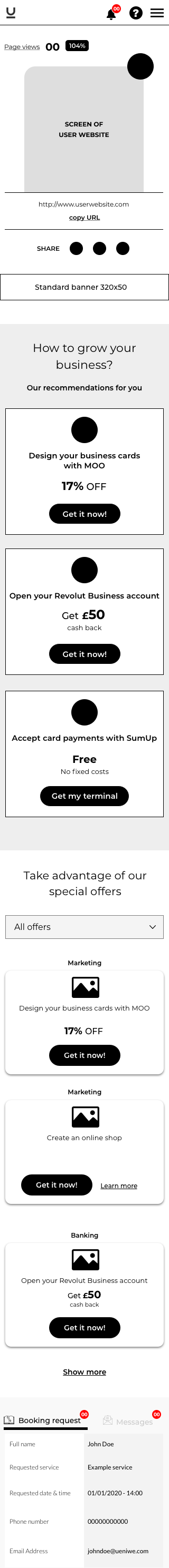
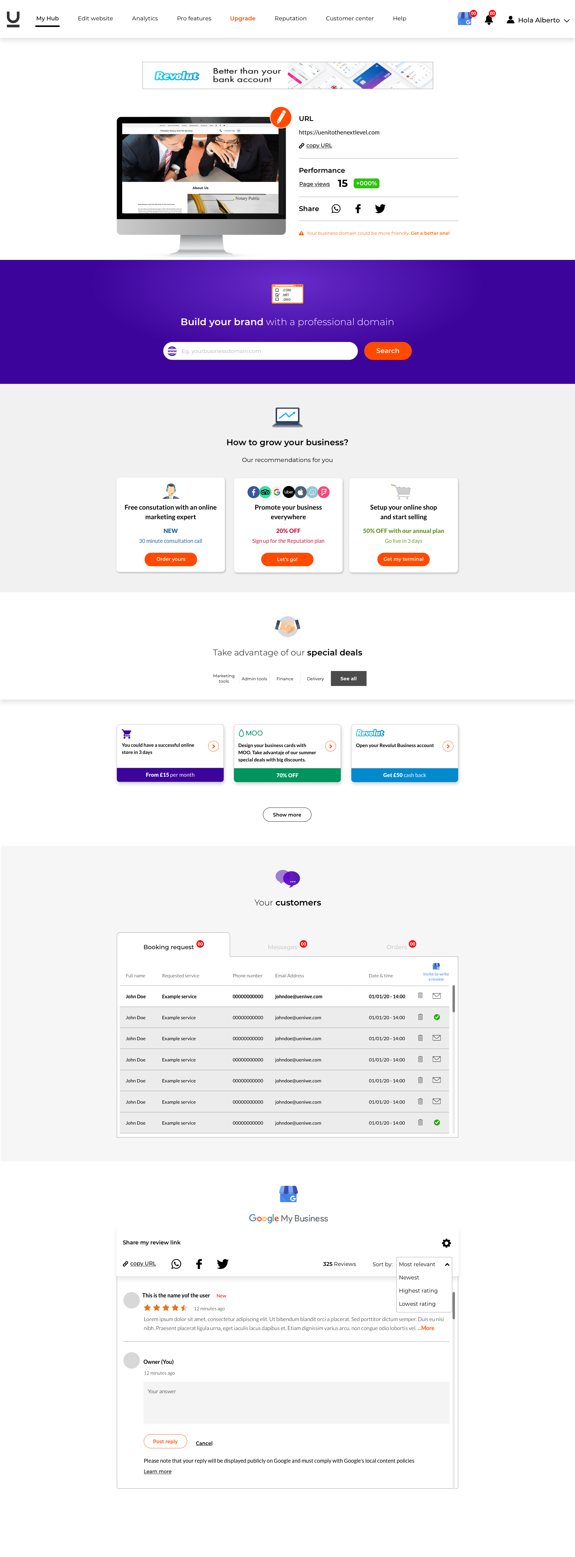
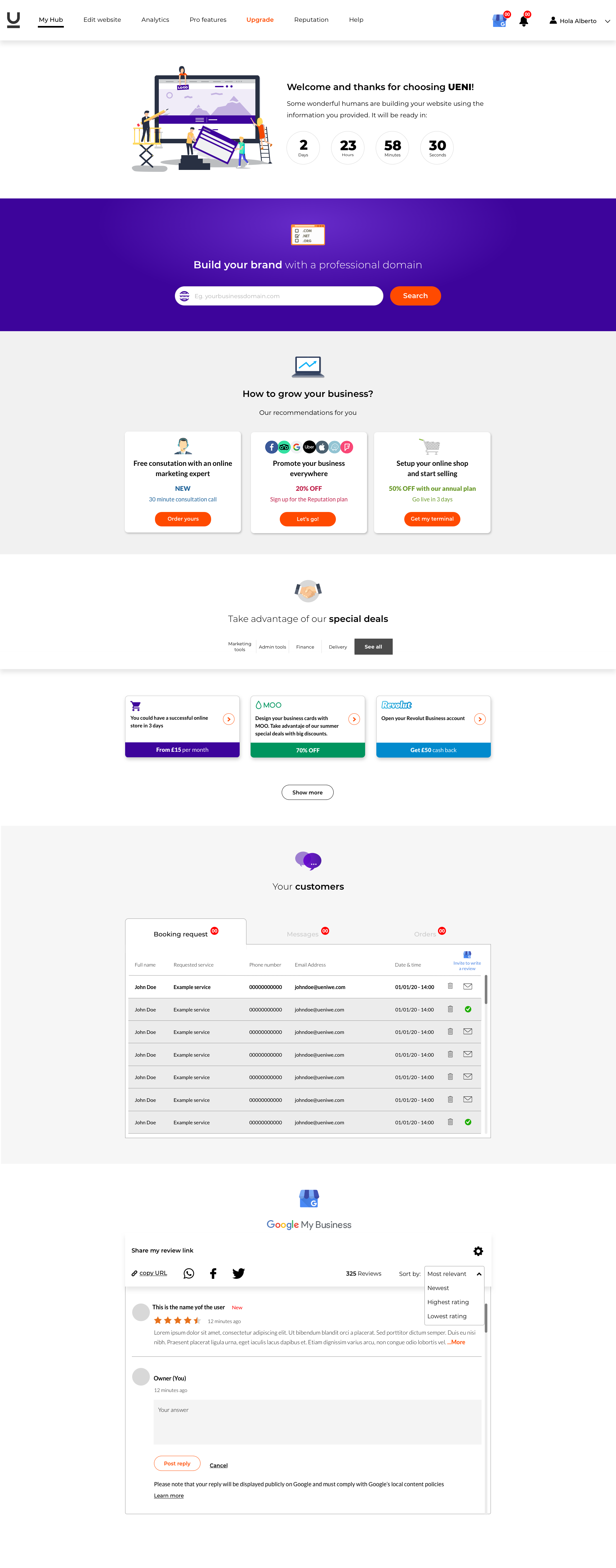
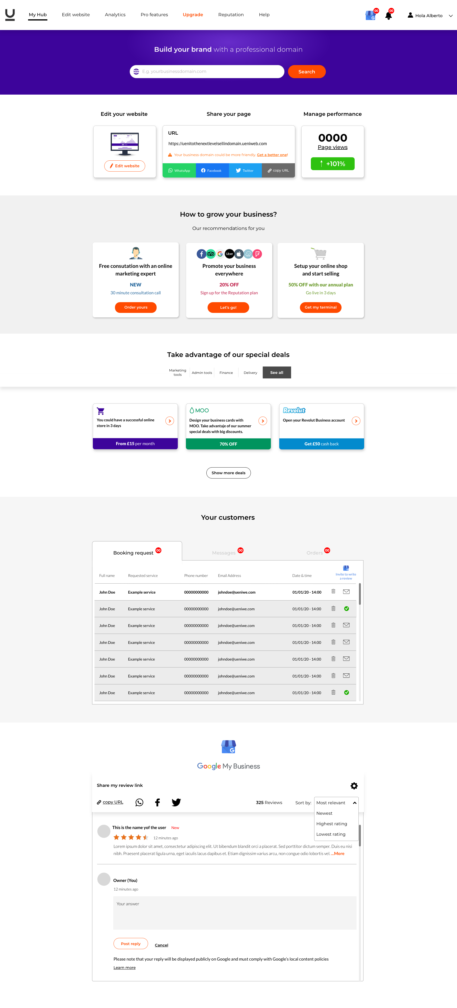
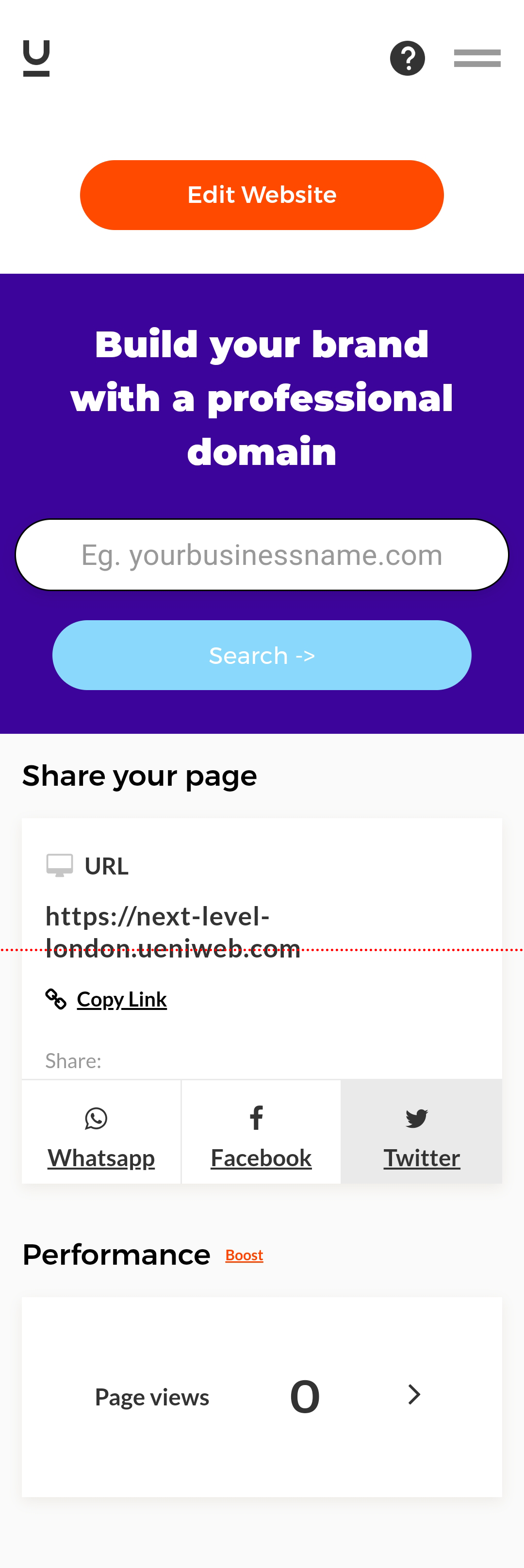
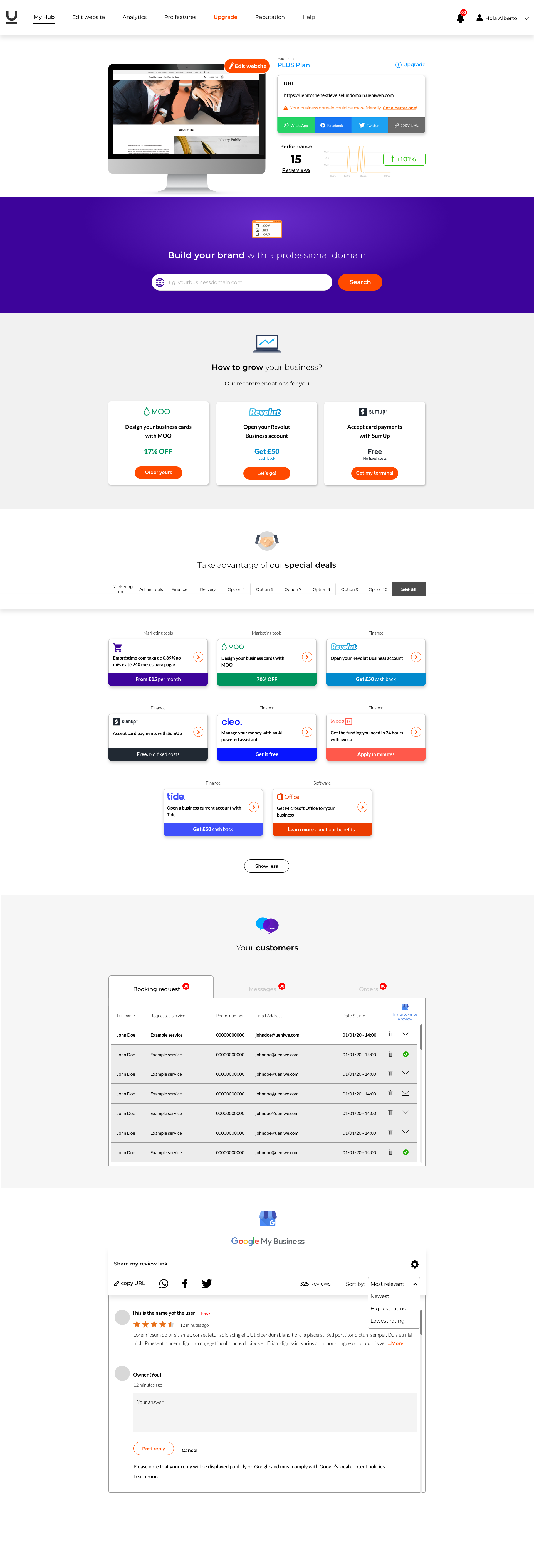
MAIN PAGE CURRENT DESIGN
ANALYSIS OF CURRENT DESIGN
ABOVE THE FOLD
Above the fold was dominated by the domain search component, seemed the website as a domain seller, no a website builder provider.
As a user, I didn't have any tools or features for my company except the Edit Website button and a small view of my website's URL, without seen the sharing tools and page views component.
“Above the fold was centred on the company business instead of providing the users a good experience over the product they are paying for”.
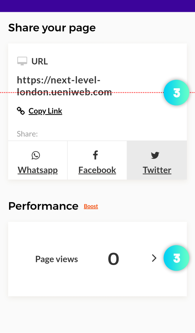
USER TOOLS AND FEATURES
As a user, I only had a tool to share the website with Facebook, Twitter, and WhatsApp networks, missing the most important networks for a business, Instagram, and Linkedin. This tool was not very useful because it was incomplete.
I also had the page views information with a small graphic indicating whether the page views are increasing or decreasing, but this information was not clear, because I didn't know the length of time of these page views. Are they monthly? weekly? Are they the total of the page views since I created the website? This feature also was incomplete.
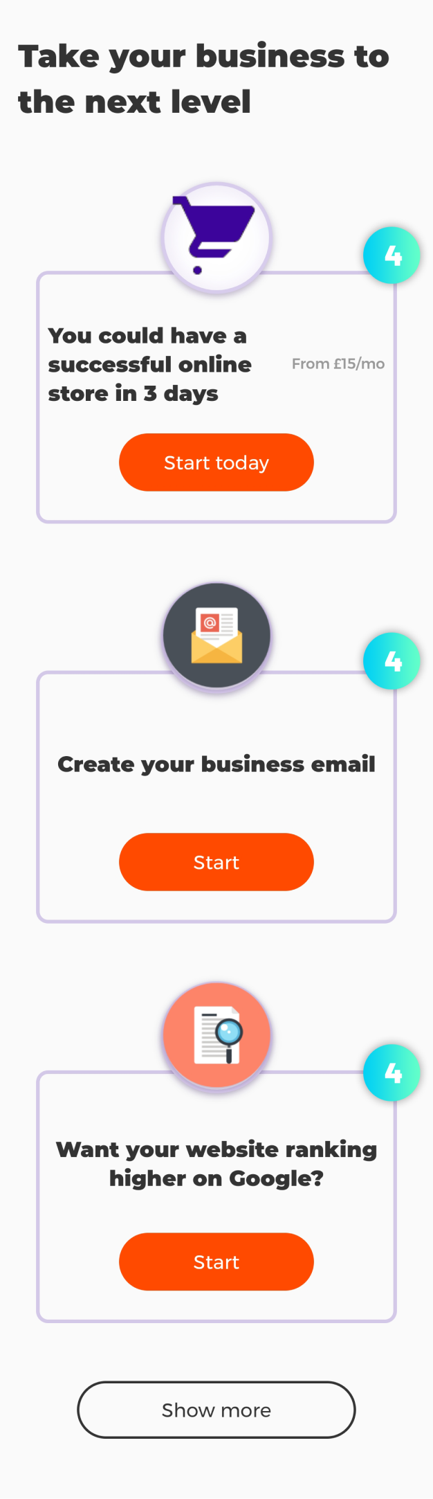
COMPANY DEALS AND PARTNERSHIPS
The information regarding the company deals and partnerships was very few. As a company, they didn't provide me any value or reasons why I should take advantage of them. The list was disorderly and it was not customized for my business. Also, the information provided on each tile was very poor and none was highlighted over others. In theory, they are special deals to help my business but I had almost no information about them. This section didn't provide any value to me as a user, and, therefore, as a company was not generating almost any profit.
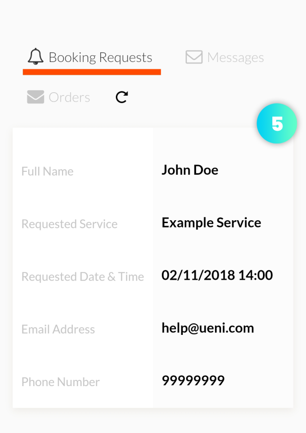
CUSTOMERS’ REQUESTS MANAGING
The component to manage customer requests provided very basic information and, it hadn’t the possibility to answer the clients, sort out the requests, or not even delete them. All communication with the customers had to be done and following by email.
The design of the component was not very user friendly. It hadn't tabs to get each section, it was only visible one request instead of a list with all requests. It didn't have also a notification label to can recognize the new messages. In general, the user experience was very improvable.
CONCLUSIONS
As a customer, I could observe that the hub didn’t look like a control panel/dashboard of a website builder platform. I didn't have any information about the product that I was paying for and my current plan. The tools provided were very basic, incomplete, and didn’t look like they were going to help me to improve my business.
The main hot point where the company gets customer upgrades, the domain searching component, was straightforward and clear, but it was using a lot of space on the layout. The other points where the company makes business could be improved by giving order and highlighting the most interesting partnerships over the rest in terms of profit.
The company didn't provide any onboarding feature to help the users to understand the control panel and how they could improve their business with the tools provided.
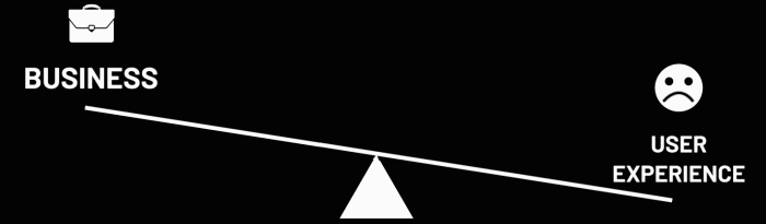
“The page was focused on conducting the business instead to provide a good user experience bringing to the users the most important tools for a digital business and, giving value showing them how the partnerships and tools could grow their business and get better results”.
HYPOTHESIS
The hypothesis was that putting at the front the most important tools and conducting the users to the tools and company partnerships through improving the information architecture and an onboarding plan that shows them how they can grow their business using these features, would imply a pronounced increase in the users’ upgradings and churn reduction.
MAIN OKR’S FOR 1ST QUARTER
MAIN PAGE FIXING
- Improving the user experience giving them value through better information architecture, giving more value to the users' tools above the fold and, redesigning the user interface.
- Improving user engagement showing them at the front the basic digital business tools and giving them a better approach of the advantages of the tools and the company partnerships could get growing their business.
- Creating an onboarding plan meanwhile that the user’s website is under construction. The onboarding functionality would have to help the users to know their new control panel and how to use the tools, features, and take advantage of the company partnerships.
YEARLY OKR’S
1ST QUARTER OKR GOAL(S)
- Improving above the fold user experience.
- Adding users’ websites screen.
- Improving information architecture of company’s partnerships.
- Company’s partnerships categorization.
- Creating an onboarding plan during the website building.
Main page
2ND QUARTER OKR GOAL(S)
- Adding page views graphic.
- Adding user’s plan information.
- GMB component redesign.
- Redesigning Customers' requests component.
3RD QUARTER OKR GOAL(S)
- My domain component redesign.
- My email adresses component redesign.
- My connected domain component redesign.
- Pro features tiles redesign.
Pro Features page redesign
4TH QUARTER OKR GOAL(S)
- Reputation page redesign.
- Analytics page.
- Full onboarding plan design
Next pages
NO PREVIOUS USER RESEARCHING
Despite having thousands of users to conduct research that could have clarified whether the assumptions and hypotheses were correct before making any effort and have been able also finding other pain points, stakeholders dismissed the user research for a matter of time.
“I always recommend starting with users' research before addressing product development. Investing some time at first can save a lot of time during the rest of the design process”.
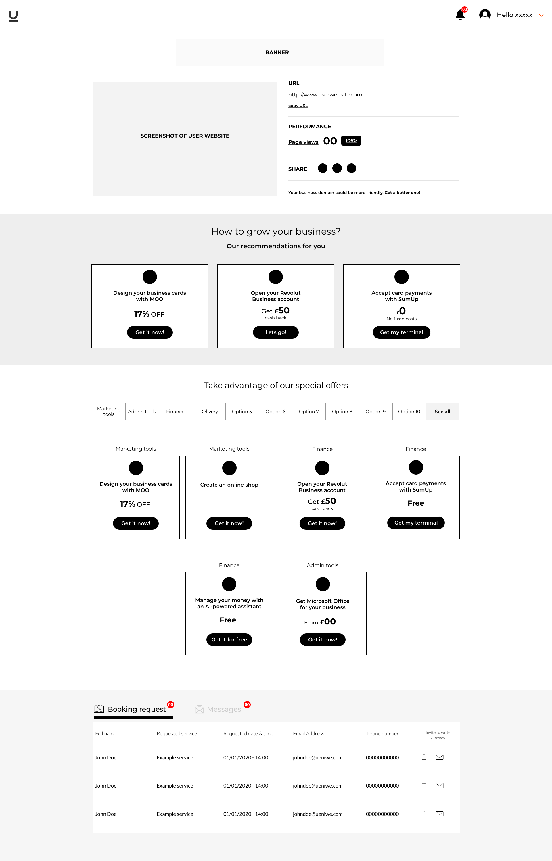
MID-QUALITY WIREFRAMES
Based on the assumptions and the hypothesis, I presented some wireframes with different information architecture and user interactions to the stakeholders. Also, I added some functionalities that I established necessary to get a better user experience.
DESKTOP
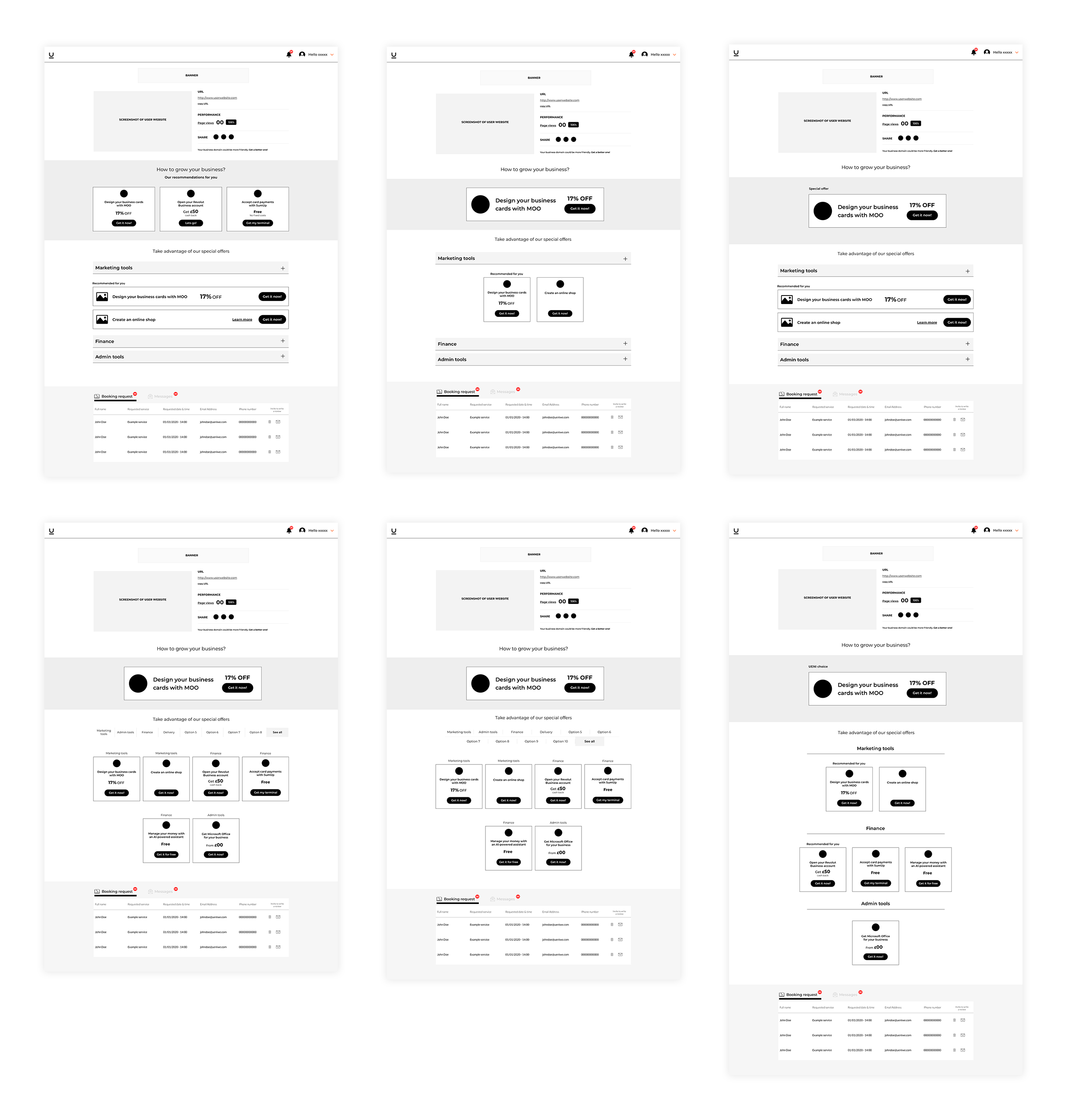
Click to open expand view
MOBILE
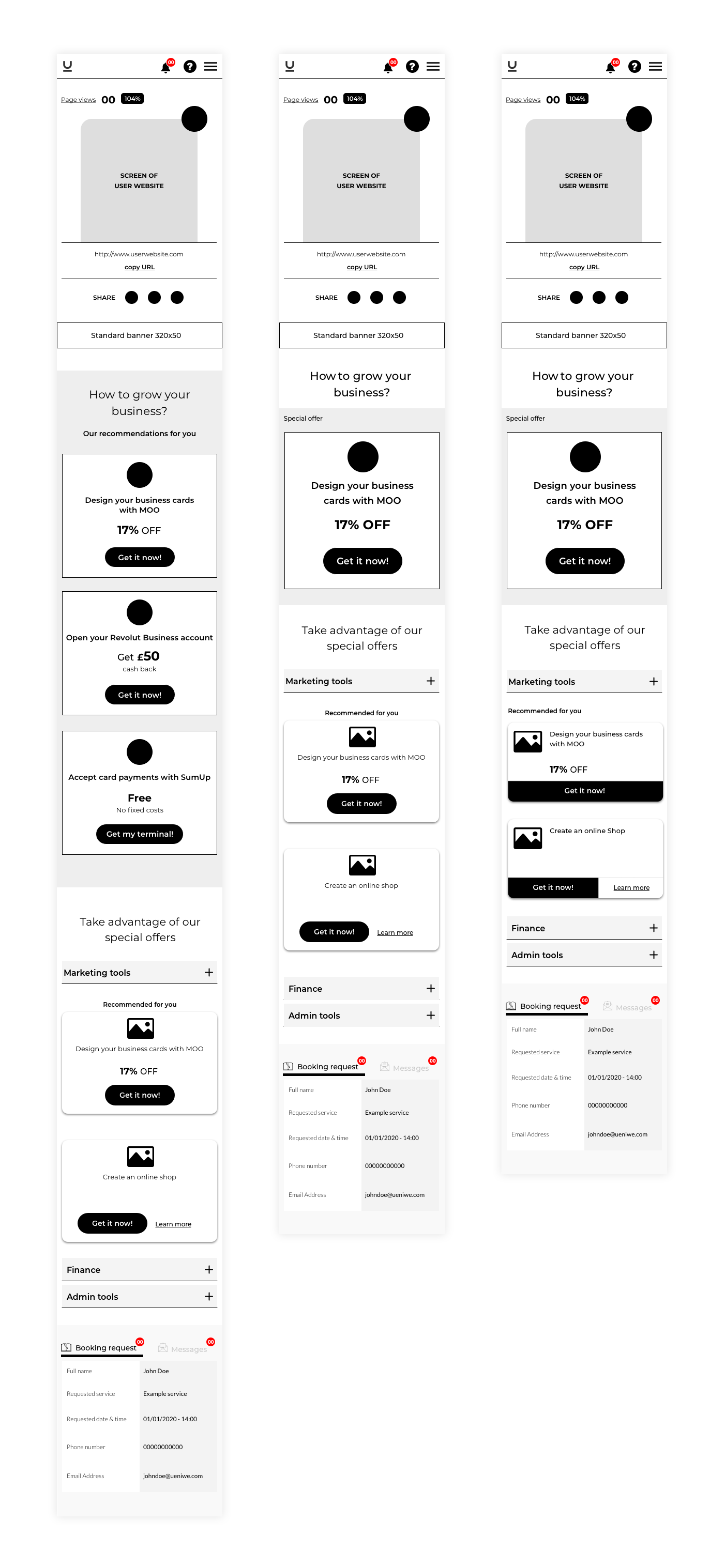
Click to open expand view
Click to open expand view
STAKEHOLDERS’ FEEDBACK
Stakeholders were found useful the new functionalities that I proposed and we decided on the best information architecture taking into consideration the time of development would need.
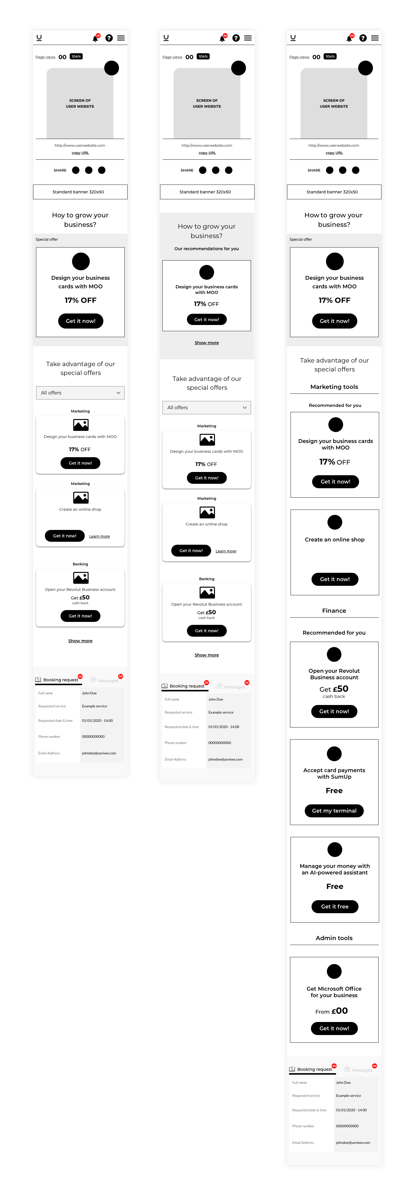
BUILDING THE FINAL WIREFRAMES ASSEMBLING STAKEHOLDERS’ FEEDBACK
I built the wireframes assembling stakeholders' feedback and following their instructions. I disagreed about some decisions because once again the design would be more centered on the business than the user experience.
BUILDING THE HIGH-QUALITY MOCKUPS
With all stakeholders agreed with the new structure and the new functionalities, I built the high-quality mockups to have the first MVP and share it with stakeholders to move forward and launch the first research with the users.


USING FEEDBACK IN THE WRONG WAY
Thus far, the stakeholder's team was composed of the CEO (working as a head of product), two project managers, and the head of marketing. At this stage of the design, the CEO suddenly wanted to collect feedback from more people inside the company. These people were selected without any criteria and they were not qualified to give feedback without conducting proper user testing. Basically, the question that was made to them was 'What do you think about this design?'
“Feedback without setting clear guidelines neither conducting proper user testing is counterproductive”.
The people who gave this feedback were not during the whole design process, so they didn't know about the new functionalities, why we took certain decisions, where we're based on those decisions, etc. The result was that the feedback brought a lot of confusion. The CEO started to doubt about decisions that were already taken, and we start to take steps backwards.
Also, more doubts arisen from the CEO in terms of the time to develop the new functionalities, and she decided to go back over the previous design, just redesigning the user interface avoiding as many new functionalities as possible, including the onboarding plan.
STARTING AGAIN
Collected the new feedback, I had new requirements and some changes to do over the first high-quality mockup.
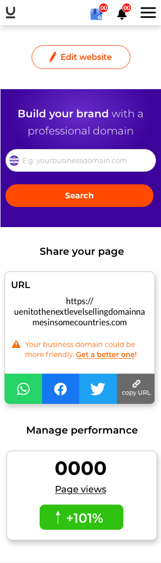
The main change was to go back to the previous 'above the fold' design, removing the user's website preview, and keeping only the 'URL and share website' and 'page views' sections.
The new feedback also questioned if the components 'Your customers' and 'Google My Business' should stay on the main page. Also, was questioned the need for the icons helped to split the sections and other UI design decisions.
From my point of view, the result once again, impoverished the user experience removing the necessary information and tools to convert the main page into a friendly control panel page. After many small UI changes were requested, going back and forth, we got the following final design.
"Basically, they wanted to go back to the old design, just with a look and feel redesign, keeping the same user experience, therefore without almost any improvement".
OLD DESIGN
NEW DESIGN
OLD DESIGN
NEW DESIGN
VALIDATING ASSUMPTIONS AND HYPOTHESIS
After some months working, we got the final design, and it was the time to launch the user testing and figure out if our assumptions and hypothesis were the right ones.
I was pretty sure about our first assumptions and how we decided to solve the user experience in the fists stages of the design were correct. The improvised second feedback stage muddied the process and, I disagreed with some decisions that stakeholders took, so I decided to launch an A/B test to verify the validity of my assumptions in the right way, asking the users.
“Nowadays, we have the luck that we count on a lot of tools to provide data from our users. All design decisions should be taken based on data collected from research and testing.”
LAUNCHING AN A/B TEST
ESTABLISHING THE KEY OBJECTIVES
The A/B test had to help us to find out what users thought regarding the new functionalities and user experience, and also to find out if the improvised feedback stage done in the middle of the process was useful or not. Therefore, the main objectives were:
- Screen preview Vs No screen preview. Figure out which of the two versions has more value for the user and why.
- Your customers and GMB sections on the main page Vs in a separate page. Find out which version users prefer to manage faster their customer’s requests.
- Icons version Vs no icons version. Figure out if icons help users to understand better each section.
- What users think about recommended tiles VS special deals. Do they understand the differences? Does it help the headline of the section above each tile to understand better the tile? Do they prefer the version where they can scroll down to see all the tiles or the version with the show more/less button?
- Figure out if users think/feel it is something missing. With this question, I wanted to figure out primarily if my assumption regarding increasing the number of social networks so that users can share their websites was something that the users will miss the most.
- Figure out what of the two designs user prefer and why.
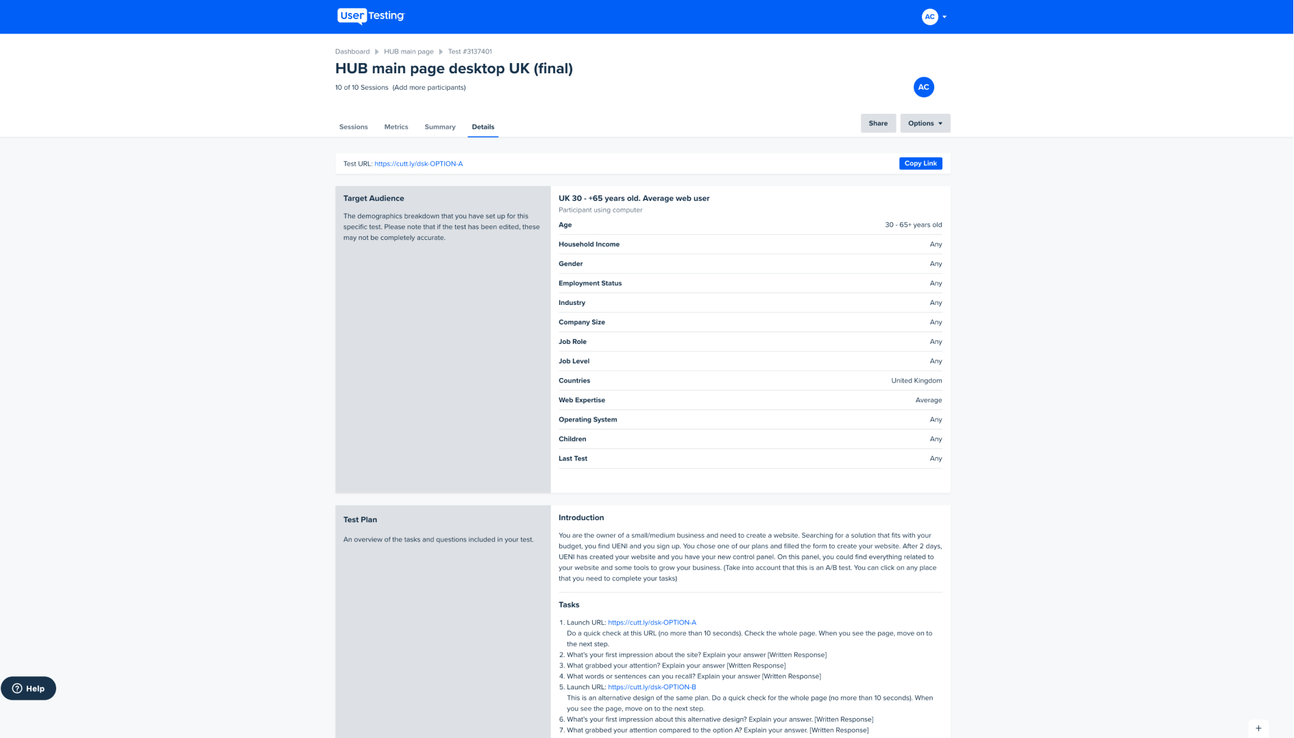
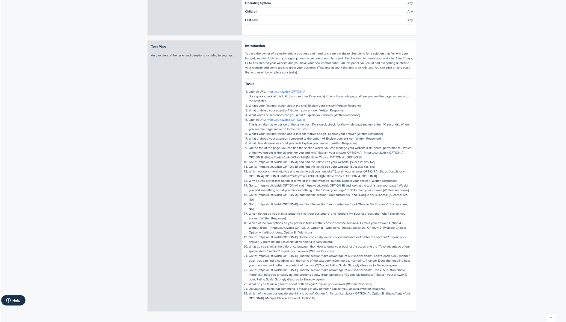
Through 25 questions where I would obtain qualitative and quantitative information, I addressed all points that were questioned on the original design, and also some decisions that stakeholders made on the wireframing stage, of which I was not convinced.
SETTING UP DEMOGRAPHIC REQUIREMENTS
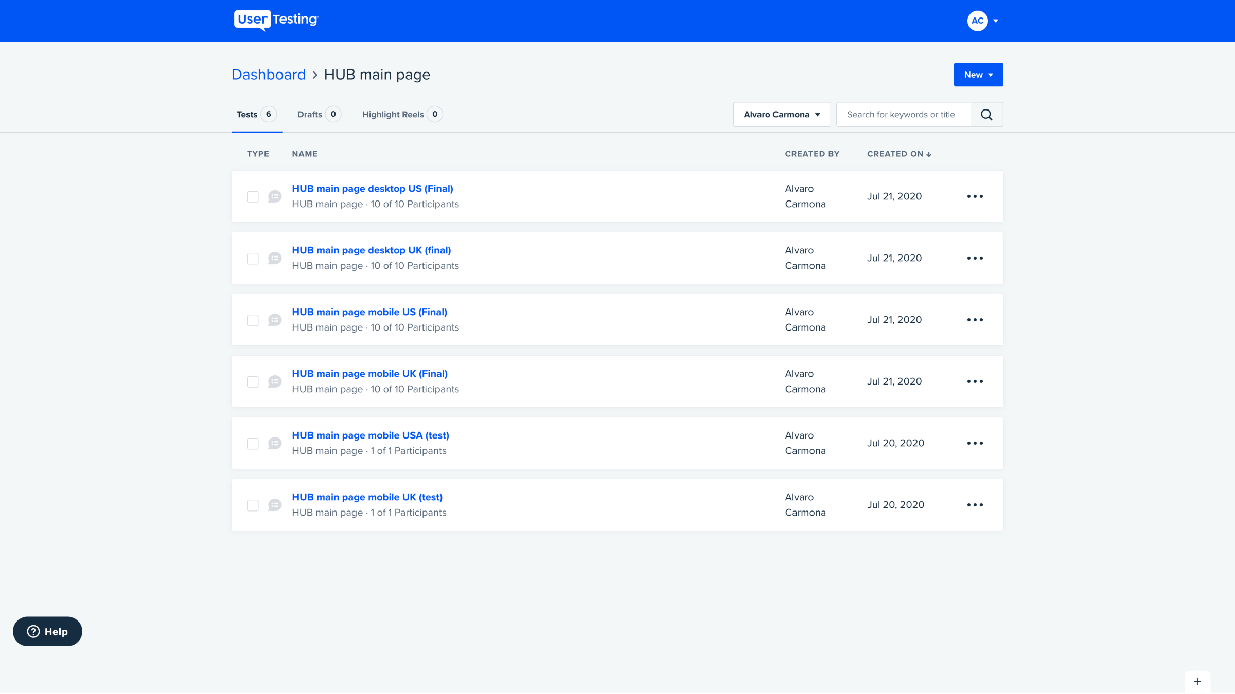
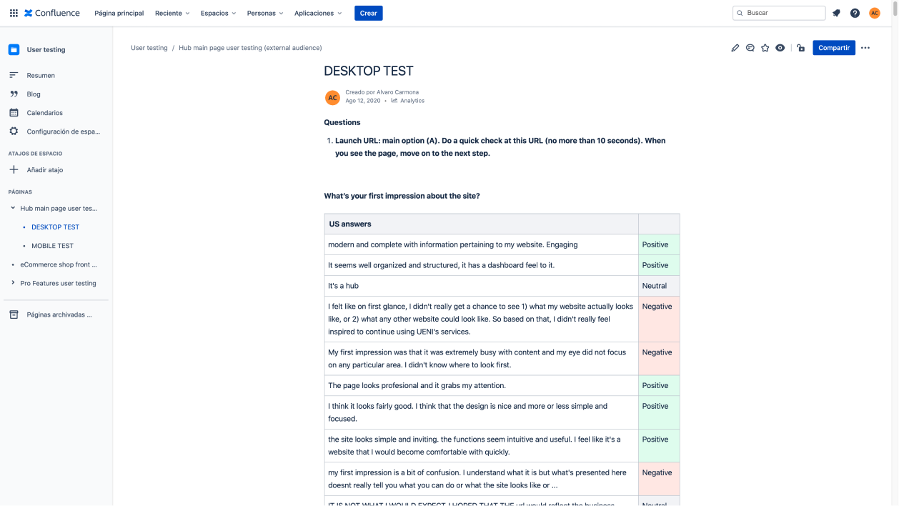
Once again due to a matter of time, it was impossible to drive the user research with our users' platform, despite having recommended it to stakeholders. So I only could make the test with external participants. I could set participants in the company's main markets, USA and UK but, due to our plan’s limitations on the testing platform, I only could segment users by age and web expertise plus the country of origin.
I split my research by country and device. I wanted to take qualitative and quantitative results, therefore I recruited 10 participants for each test. It wanted to find out if users in different countries had different approaches regarding the control panel concept.
TEST RESULTS
After a comprehensive analysis of the user research, I sorted the qualitative feedback by relevance and, I dismissed the isolated comments and little relevant ones. Also, I took the quantitative results converting them into percentages to have a clearer picture of the results.
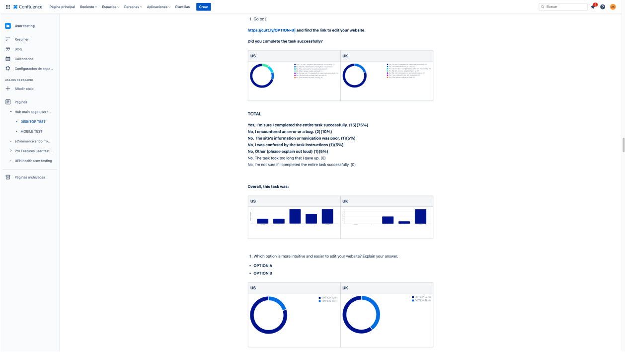
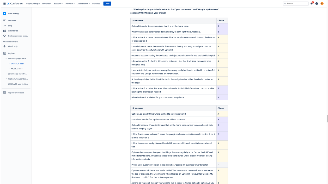
In general, the results were what I was expecting. Most of the users found option B (the original design) more usable, cleaner, and straightforward. Also, users thought that the original design was more user-oriented and looked more as a control panel. The results weren't overwhelming, but for most questions and tasks, between 65% and 70% of users preferred option B.
All the recommendations that were made during the request for feedback made by the CEO were dismissed by the users in the tests, preferring the proposals of the original design. Also, users found certain pain points that I was suspicious that they will be, for example, the number of the tiles visible by default on the mobile version, which was decided in the wireframing stage, and made users thought the design was busy.
However, users found clearer and understandable some parts of the option A design, and they missed some important information in both designs. I collected valuable tips to improve the original version by mixing both designs.
BUILDING THE DESIGN BASED ON USERS’ FEEDBACK
I built the design based on my conclusions of the users' feedback and I presented it to stakeholders.

FINAL DECISION
After six months of hard-working, we got a good result for this first redesign stage. We significantly improve the user experience by adding some functionalities that users expected and needed and improving the information architecture and the user interface design. The user research showed how the users thought the main page of the control panel should be and how it should be structured and, also what was the most important features for them.
However, the CEO decided to come back over the second option (option A on the test) and use it as a final design disregarding the results of the user research and, all previous work have done. Not only almost all new functionalities were dismissed, but also the results regarding user interface design that would have helped the user experience.
THE FINAL DESIGN

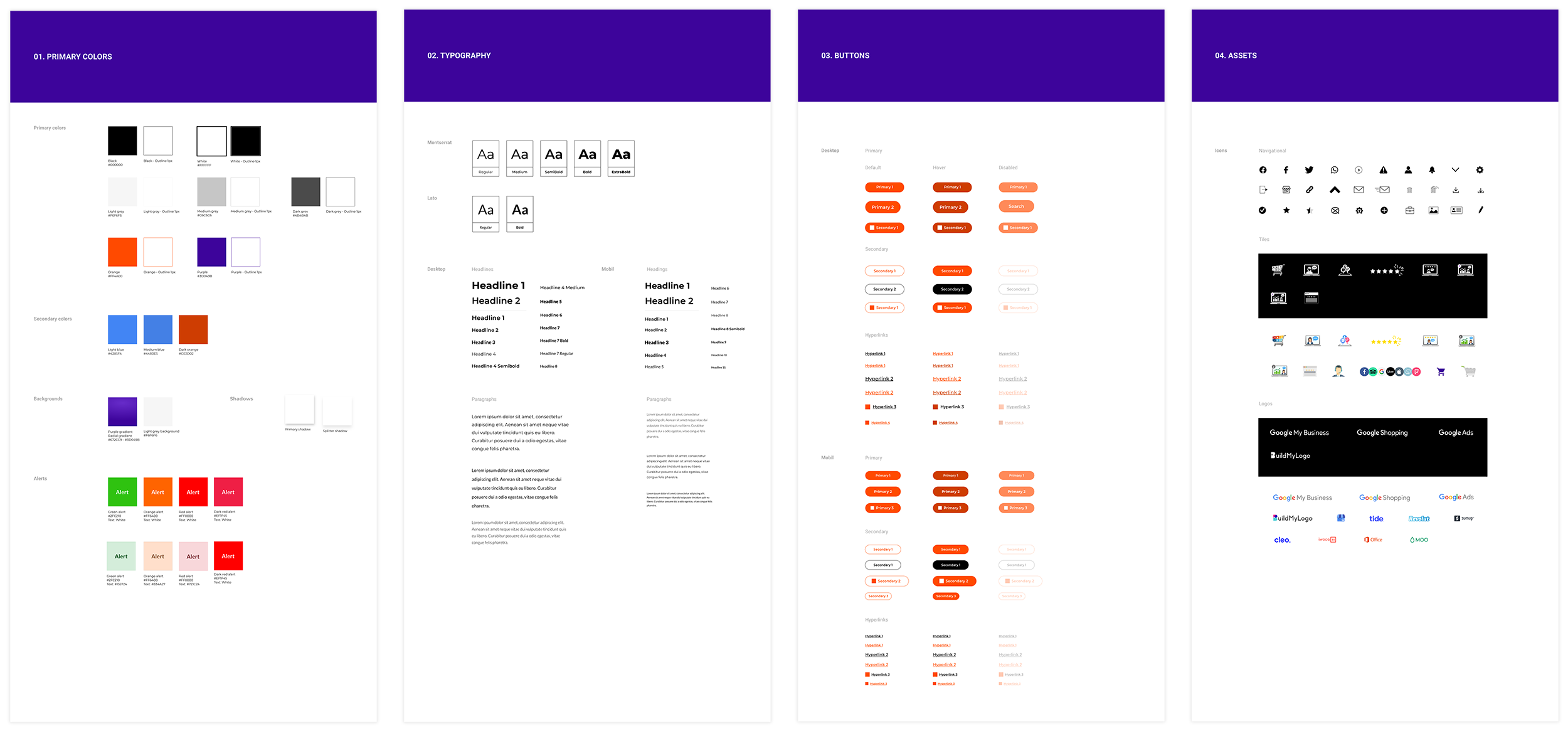
BULDING THE DESIGN SYSTEM
I built the design system with a collection of reusable components making it more efficient, consistent, and scaleable for the next design goals, guided by clear standards that reducing significantly the time and the cost of the development.
REFLECTIONS AND LEARNING
VISUAL DESIGN IS NOT USER EXPERIENCE
Unfortunately, it is still a very common problem in some companies, thinking that visual design is the same as user experience. During this project, I had to face the fact the people didn't really understand the value of the UX, the need to have a proper design process, the value of the user research on the firsts stages of the process, and also to validate the design. Once again, the decisions were taken based on opinions like 'this component looks sad', 'this icon is not beautiful', 'the page looks very white', etc, and not on results.
All assumptions and opinions could be valid, BUT always have to be validated in user research, and the decisions taken have to be based on numbers and results, not based on opinions.
THE IMPORTANCE OF THE DESIGN PROCESS
Having a design process is the best way to save money and time on each project and have order during the development. Based on my personal experience, not all the design processes are valid for all companies, they have to be adapted to the teams involved in the project, but you always have to have a design process.
In this project, it was evident the lack of the design process. This situation made us go back and forth a lot of times. We should have had a solid team of stakeholders to provide feedback in a specific amount of time and in a specific stage of the process.
But the main issue was that we didn't work as a team. It is very important that all teams are involved and in continuous communication in all stages of the process. It is very important the design team can explain their decisions to the stakeholders and discuss them together. The lack of communication on this project was evident.
FOLLOWING USER’S FEEDBACK
When I arrived to the company, they didn't have any design process that includes users research and users testing. I explained to the CEO how important is to include users' research during the design process. Finally the CEO was aware of the need to contract a user testing tool to drive our users testing, and the company invested on it.
The user testing tools suppose a big investment, and more for small companies. It was a big surprise when the CEO disregards the users' feedback in the research. Why did the company make such a large investment of money in the tool not to follow the research results?