DESIGNING A NEW APP
The Herbalife´s top seller in Europe, hired me to design the new native APP based on a website's APP where its customers can follow their diet-plans, manage their results, follow up their progress, and have some tools to help them to achieve their goals.
THE CHALLENGE
Build a clean and straightforward App with a high-quality user experience making it easier for the users to upload their nutritional studies, understand their results and progress, and allowing them to find the relevant information as faster as possible. The goal of this app was to replace the current website app, increasing the rate of use of the system.
ANALYSIS OF THE CURRENT WEB APP
The system has three different subscriptions to have access to the platform. None of them for free. The app has center on two functionalities, nutrition study, and diet plans. Also, the app had several simple functionalities to calculate body measures that help the customers to achieve their objectives. It has a blog with some information relative to nutrition, workout, and Herbalife business.

CONCLUSIONS
Nutritional Studies
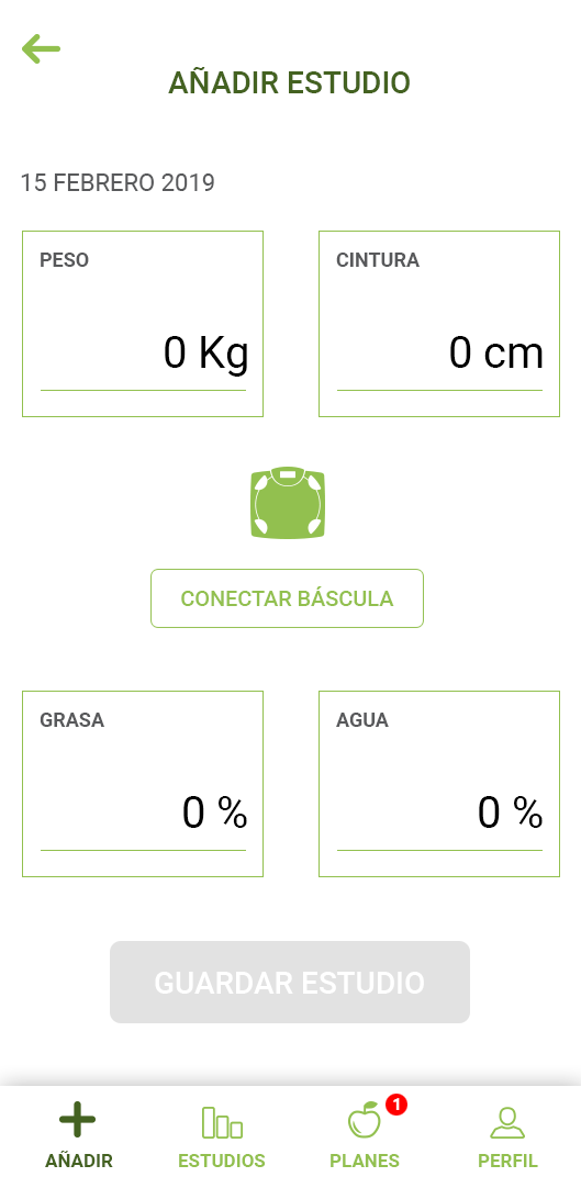
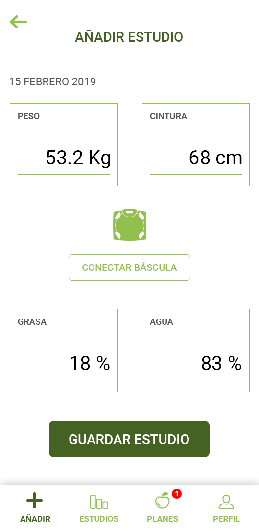
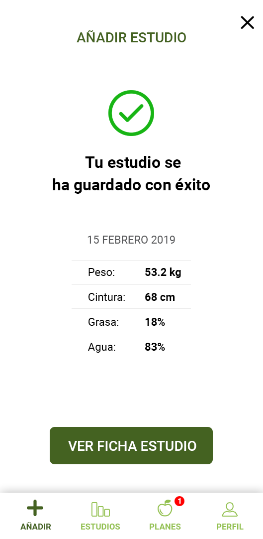
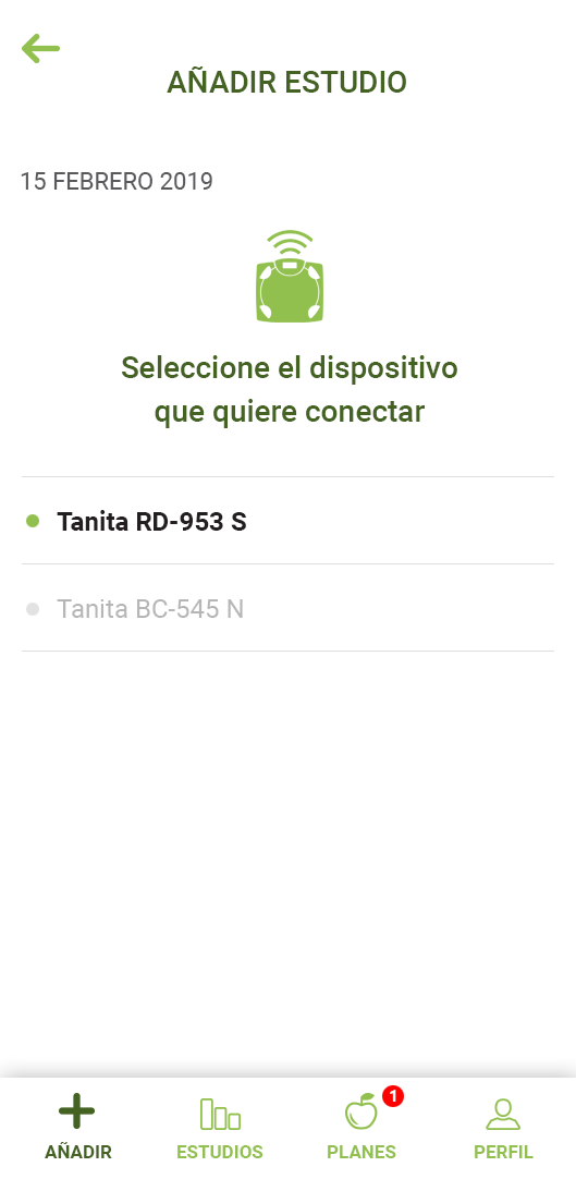
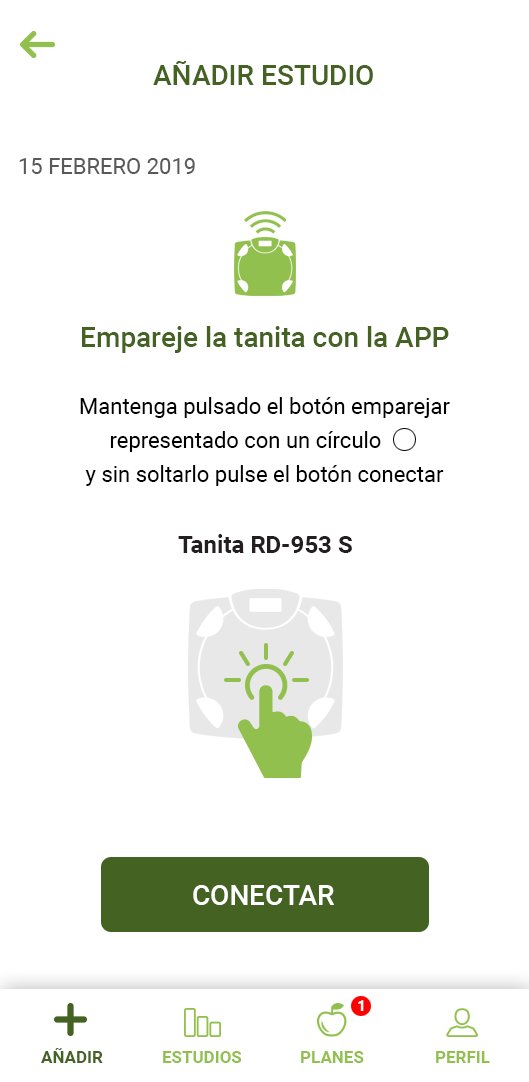
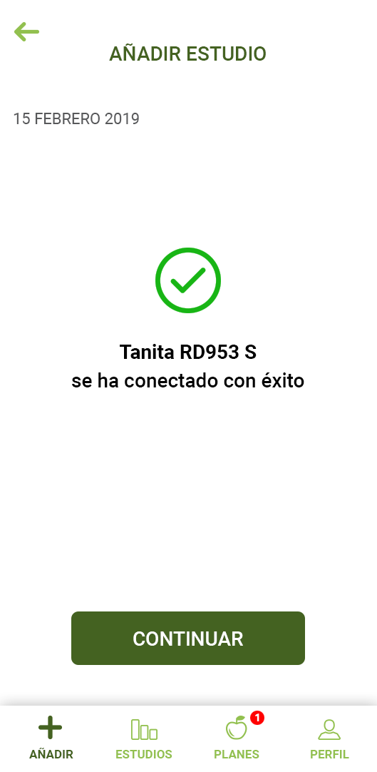
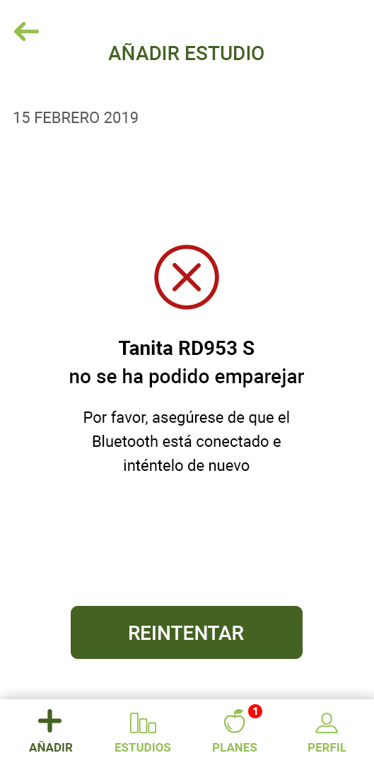
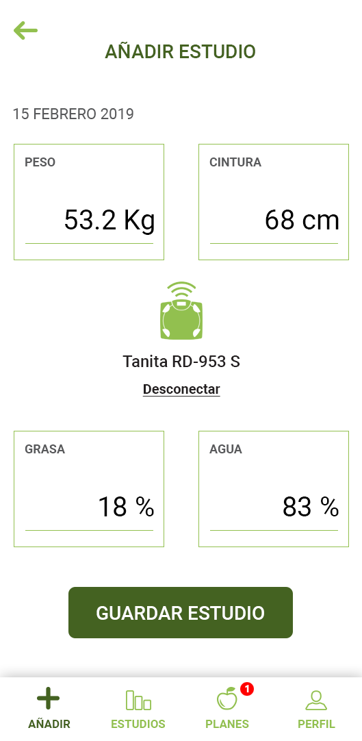
It was the main functionality and the more complex to develop. The whole business was centralized on this functionality. This functionality gives the main information so that the APP can assign to the users a pre-made diet that matched with their results. The users could introduce the data by themselves or link with the system a Tanita scale.
Food plans
When the users introduce their data throughout the App or the Tanita, the system automatically assigned a pre-made diet based on their results. To can achieve their goals, users had to do the nutritional studies each certain time, and with the new data, the system assigned a new food plan.
Wellness calculators
Four small functionalities that gave information related to heart rate, calorie consumption, etc. But this information was not linked with an external watch or bracelet. The users had to introduce the data manually, and the system didn't save the data nor the progress. I found these functionalities useless considering the current devices on the market that give much more range of possibilities and information.
BLOG
A complete blog section with different topics where the users could find valuable information about nutrition, workouts, and information relative to Herbalife's business.
MY ADVISOR
A simple functionality where the users and customers could keep in touch. The functionality only allowed to write and respond to messages, without any other tool like send documents.
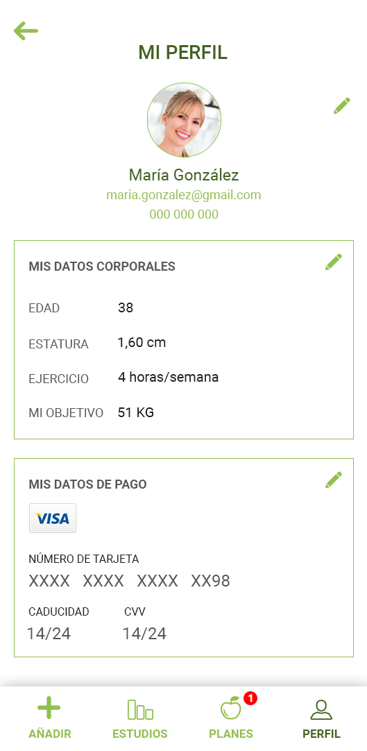
PROFILE
The place where the users managing their personal information, their nutritional goals, and their subscriptions.
HYPOTHESIS
Considering that the native APP was not going to replace the website App, I assumed that most of the functionalities could be dismissed on the new App and, we could center it just on the main functionalities where the business is centered, the nutrition studies and the food plans. With this approach, the company could save money and time developing the new App, and make it simple and usable for the users. A requirement was the app was only accessible throughout a Herbalife's distributor who has previous access to the system.
VALIDATING HYPOTHESIS WITH A QUANTITATIVE USER RESEARCH
THE QUESTIONS
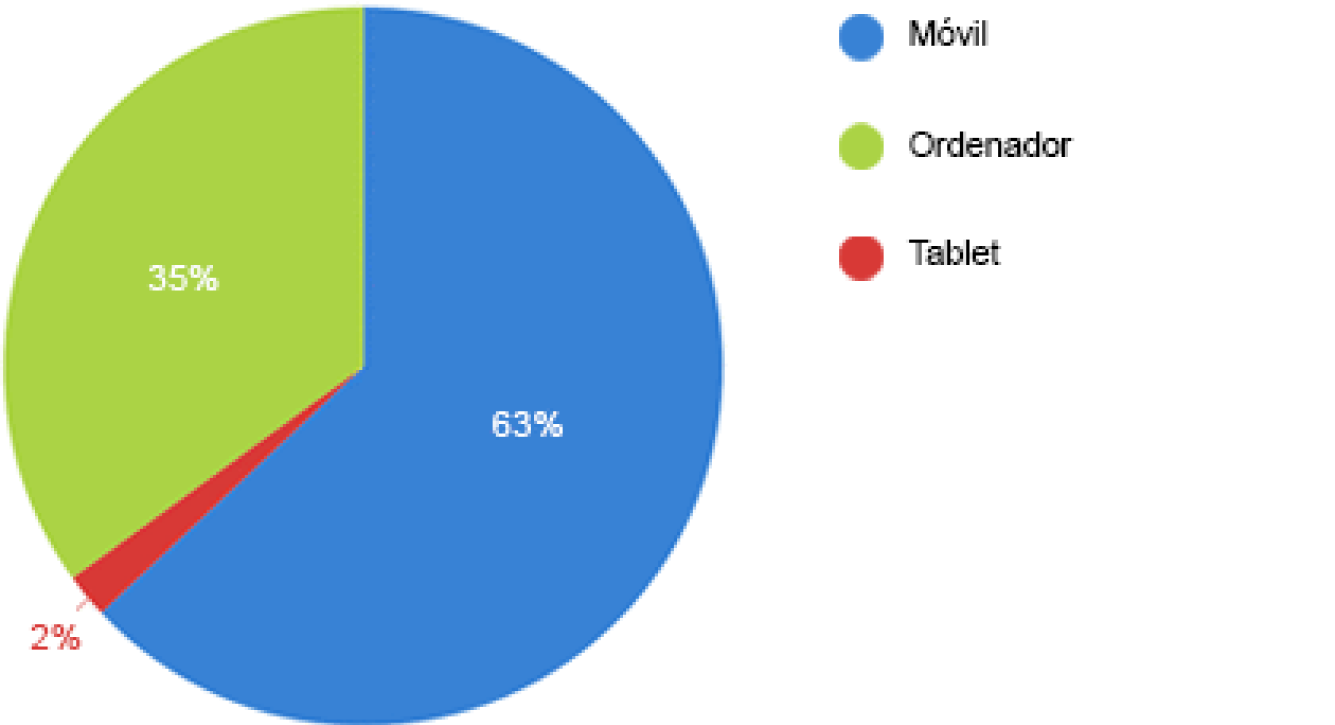
- Mobile
- Computer
- Tablet
What device is usually used to enter the system?
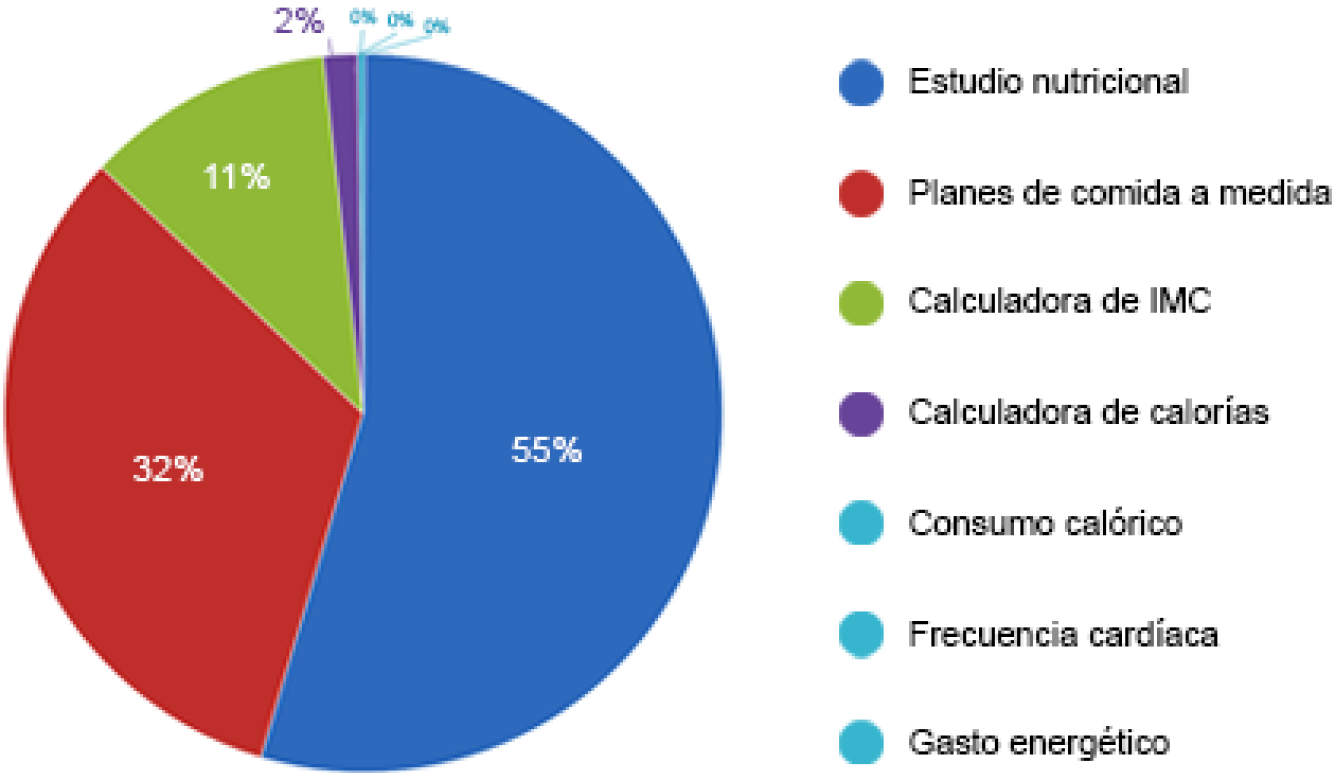
- Nutrition study
- Custom meal plans
- IMC calculator
- Calorie calculator
- Calorie intake calculator
- Heart rate calculator
- Energy spends calculator
Choose the functionalities of the system that you more use.
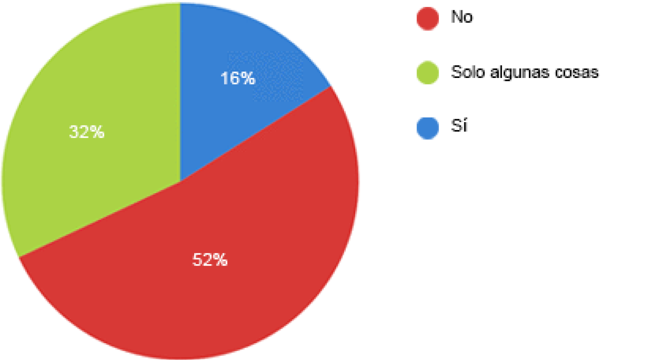
- No
- Only sometimes
- Yes
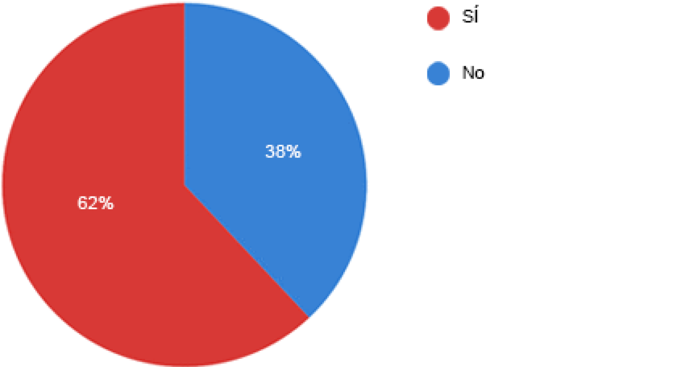
In general, do you think the system is easy to use?
- Yes
- No
Do you use a bioimpedance scale?
CONCLUSIONS
I could find out that my assumptions and my hypothesis were correct. Most of the participants had the same thoughts about the value of the functionalities and the user experience of the system. The use of the web App was centered on nutrition studies and diet plans.
To confirm my assumptions and hypothesis, the following step would be conducting a workshop with several users of the current web app.
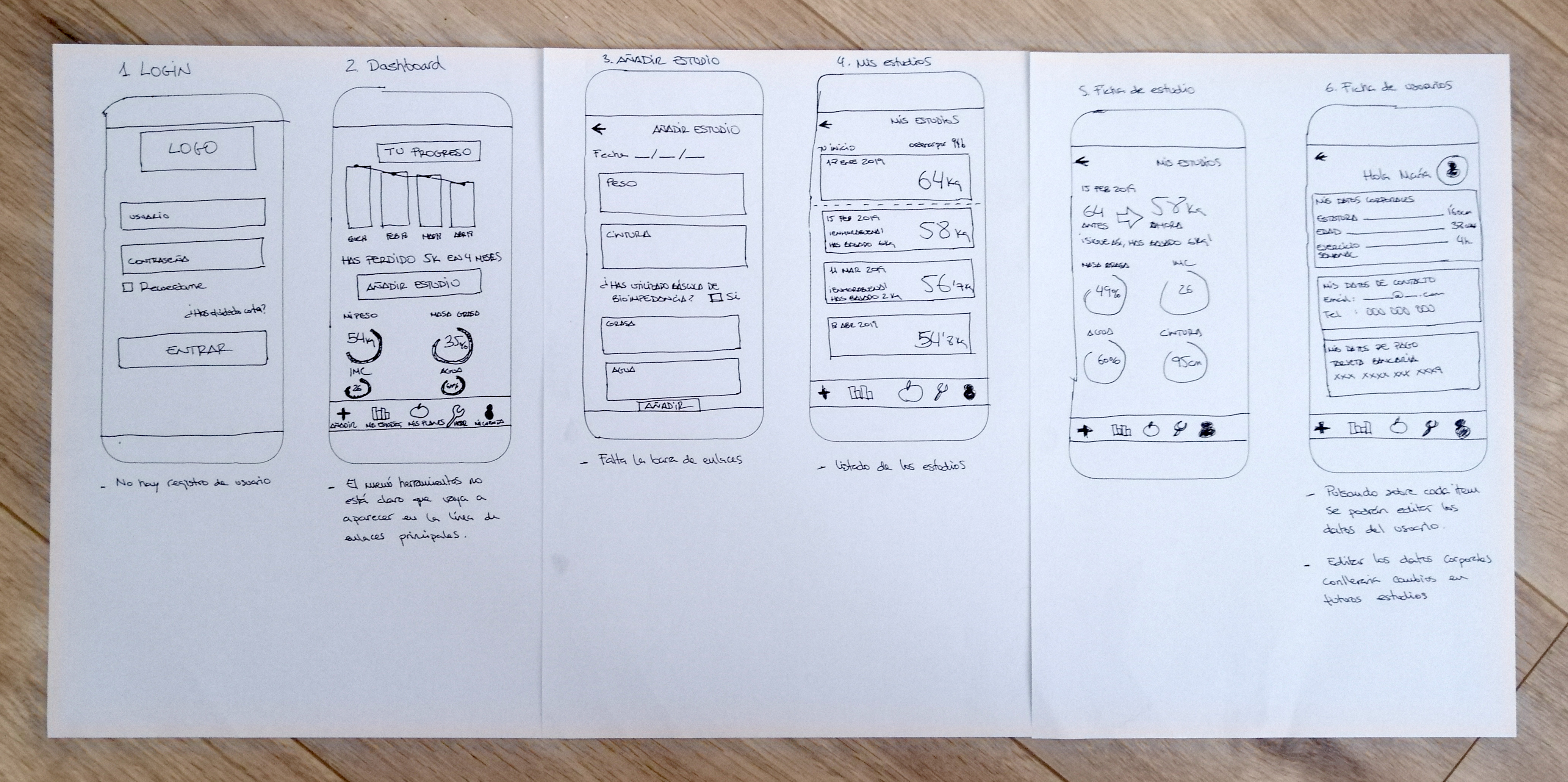
Designing low-quality mockups for the workshop
I designed some low-quality mockups to share with the participants of the workshop and have the base to discuss the user experience of the new app. I sketched the main functionalities being sure of how the user experience should be. I included everything necessary for the APP to fulfil every requirement of the customers which would speed up the interaction with the system.
CONDUCTING A WORKSHOP
I brought together the five more active users on the system to ask them how they thought the new APP should be, what functionalities we should keep, if we had to add other functionalities, how the user experience should be, etc.
Workshop goals and questions
GOAL
FUNCTIONALITIES
- Validating user research with the participants.
- Analyzing the main functionalities and how they could be improved.
- New functionalities proposals.
- Building the new app’s map.
QUESTIONS
FUNCTIONALITIES
- Select the functionalities that you more use on the system. If you don’t use some of them, don’t include them.
- Look at the user research results. Are you agree with them? If the answer is no, why?
- What functionality do you think is more important in the system and why?
- How would you improve that functionality?
- Which data on the nutrition study is the most relevant for you?
- Which data on the nutrition study do you think is irrelevant?
- What functionalities of the system would you delete?
- Do you think the system needs the functionality that it doesn’t have? Which one?
- Look at this sitemap. Remove the pages that you think are not necessary on the new App.
GOALS
USER EXPERIENCE
- Finding pain points or issues on the current web app.
- How to solve the pain points found.
- Presenting the low-quality mockups and taking feedback of them.
- Analyzing if the pain points found could be solved with the mockups presented.
QUESTIONS
USER EXPERIENCE
- Think about the functionalities of the system. Do you find some of them especially difficult to understand how it works or how you have to manage it? Which one? Why?
- How would you solve or you would make easier these functionalities? Explain your answer.
- Describe the most common issues you find when you use the system. Where they are? What is the issue?
- Make a comprehensive check of these mockups. Considering what we found on the user research and your personal use of the system, do you think something is missing on any screen? Explain your answer.
- Do you think the mockups have all the functionalities that the new app should have? Explain your answer.
- Do you think that everything is apparently easy to understand and manage? Explain your answer.
- Do you think that the issues and pain points that we found in this workshop, could be solved with this mockup? Explain your answer.
- Would you add something? Where? What? Why? Explain your answer.
Workshop outputs
- Every participant thought that nutrition study is the most important functionality of the system. The second one was the diet plans.
- They agreed that the most important data in the nutrition study are weight, waist, fat, IMC, and water.
- They agreed that wellness calculators don't give any value to the users.
- They agreed that “My advisor” functionality was not necessary because all the communication with customers was by WhatsApp and they didn’t use the tool.
- They thought that it is not worth it to implement a chat with the advisor because all of them communicate with clients by WhatsApp.
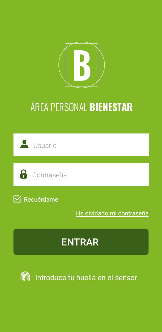
- The participants thought that it would be interesting to be able to log into the App with a fingerprint.
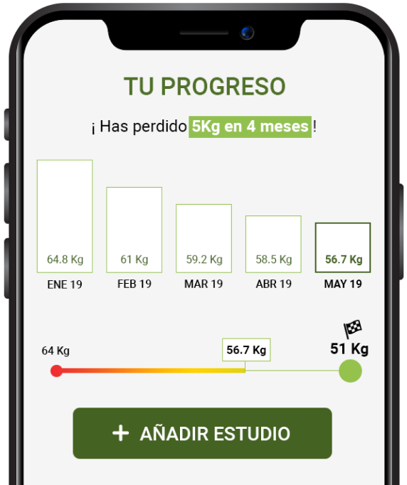
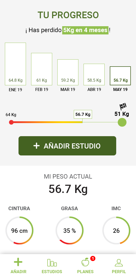
- The participants thought that it would be useful to be able to add a goal and can see the progress visually on the main dashboard.
"With this workshop, I could know that my hypothesis was correct, and also, my first low-quality mockups were very close to what the participants thought the new app should be. However, they gave some good suggestions in terms of user experience that I would apply to the next mockups".
THE NEW STRUCTURE
Based on workshop outputs, I redesigned the new information architecture keeping just the functionalities that were valuable for the workshop's participants.

Validating actions with stakeholders
I needed to consult with the stakeholders and IT manager about the possibility of developing the new functionalities participants suggested and if there was a budget to do it. Finally, the functionality was approved to include the development of the APP.
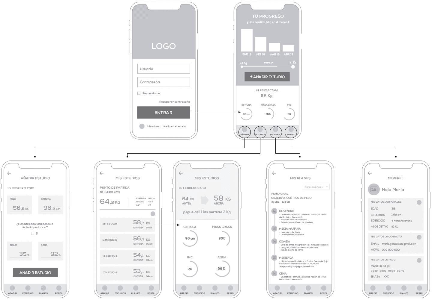
BUILDING MID-QUALITY MOCKUPS ASSEMBLING STAKEHOLDERS FEEDBACK
Base on the research’s results and the workshop outputs, I designed mid-quality mockups for each functionality. I defined each interaction and an approximation of how the user interface would be.
RUNING A USER TESTING
I asked for new volunteers that they were active users of the system to run a user testing of the mid-quality mockups. I arranged five participants' user testing with different people than the workshop to avoid possible bias.
Establishing the key objectives
For the most part, user testing was focused on figure out possible pain points in the user experience and measure the usability in the key functionalities through several tasks. It was impossible testing the user experience when users do the nutrition study with a bioimpedance scale. This functionality will be tested after the back-end development stage.
- Evaluating the user journey to add a nutrition study. Measuring the time to complete the task. Finding pain points or improvements.
- Plans section. Understanding of the data. Data not added. Finding pain points or improvements.
- The dashboard (main screen). Understanding of the data. Data not added. Finding pain points or improvements.
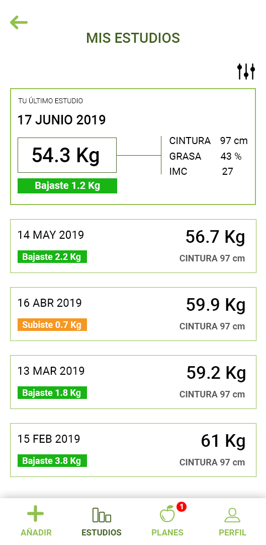
- My studies listing section flow. Understanding the data. Data not added. Finding pain points or improvements.
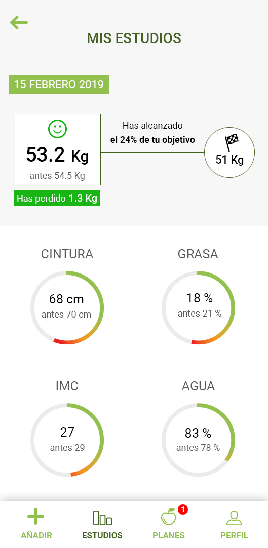
- Nutrition study card. Understanding the data. Data not added. Finding pain points or improvements.
- Profile section. Understanding the data. Data not added. Finding pain points or improvements.
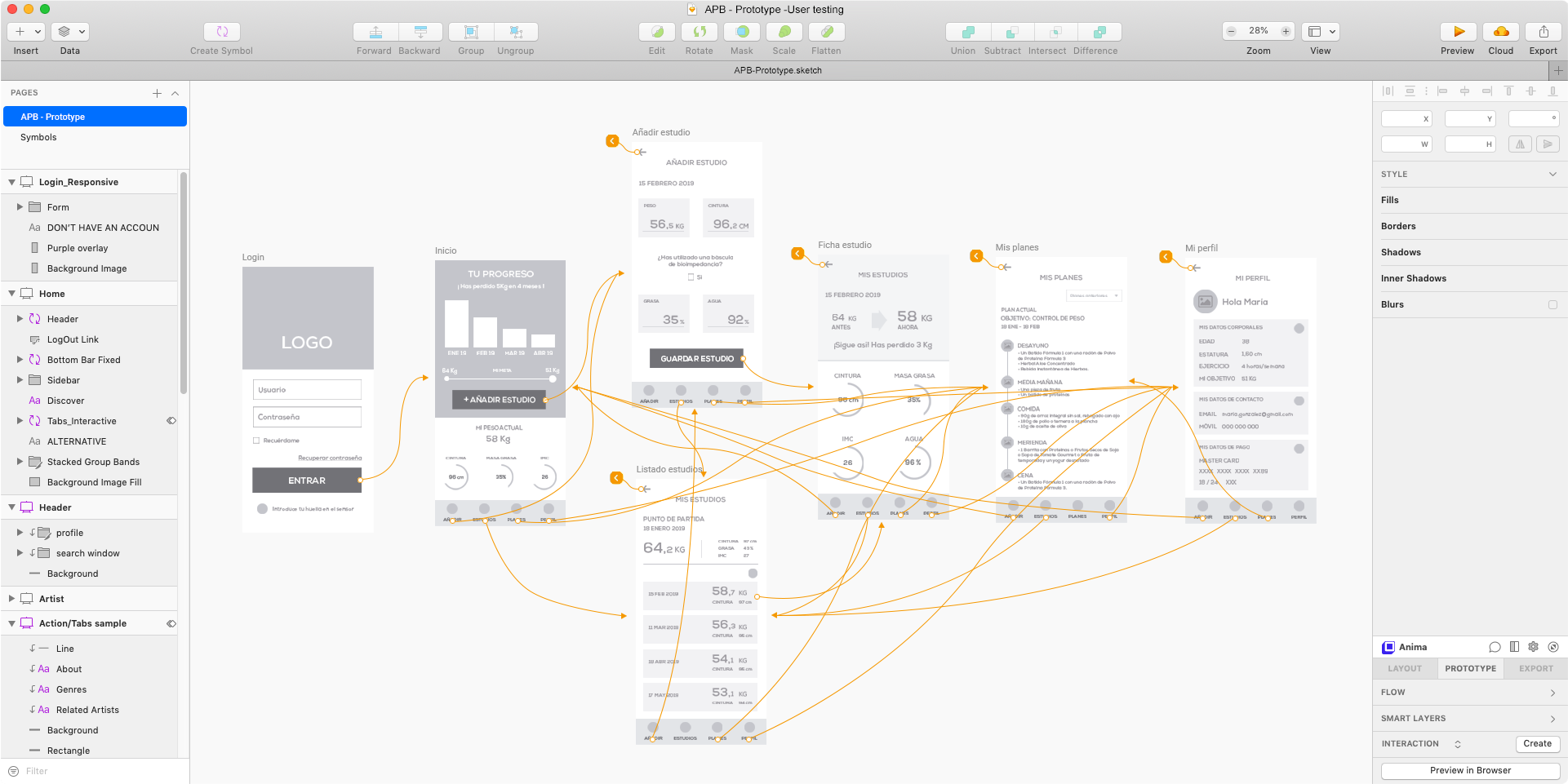
I couldn't count on a user testing platform to run the test, so I shared a prototype on Sketch Cloud with the participants. I also created a survey in Google so that participants could follow up on the tasks, write their replies. With this method, I also would have a summary of the results and help charts.
TEST RESULTS
In general, the participants interacted very well with the prototype. They thought that the user experience was very user friendly, easy to understand, and straightforward to the main functionalities. Add a new nutrition study, which is the main functionality, took only some seconds for all the users. In the rest of the sections, users also met the tasks just in a few seconds. The usability was very well. However, they found some elements that could be improved. The suggested:
- In the main screen, the participants were agree that would be good idea to add the last result of the weight on the progress bar.
- The participants found confusing 'My studies' listing screen. They expected to see at the top the last results instead of the starting point. They suggested also the possibility to have a bar chart also on this screen.
- The participants thought that the 'Nutrition study card' was a bit confusing. They would prefer to be able to see the weight highlighted, and they thought that the progress to the goal was not clear enough. Also, some of them thought that would be a good idea to have the first measures together with the new measures to encourage the users.
- The participants missed a notification when a new plan is added.
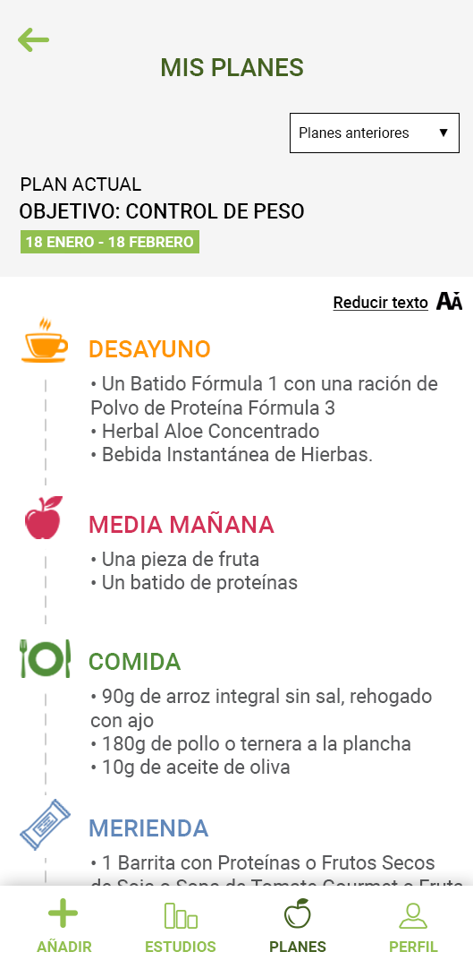
- The participants thought that would be useful to have the possibility to increase or decrease the size text on Plans section.
The user test was a success. The users could complete every task assigned in a short time and with hardly any doubts.
PRESENTING THE TEST'S RESULTS TO STAKEHOLDERS
I wrote a report and I presented the results to stakeholders. The results of the test didn't show out new needs or new user experience pain points, so we were discussing the app in general. We put the focus on the cost-benefit of the new functionalities considering the value that users gave them during the research and the testing. We agreed on will worth it to develop the new functionalities because the cost would not very significant compared with the possible benefits. All proposals from participants were accepted except for adding a bar chart on the Studies listing screen, which made sense neither for me nor stakeholders.
We closed the mid-quality prototypes adding the participants’ suggestions that we agreed about, and we move forward to design the high-quality mockups.
BUILDING THE MVP. HIGH-QUALITY MOCKUPS
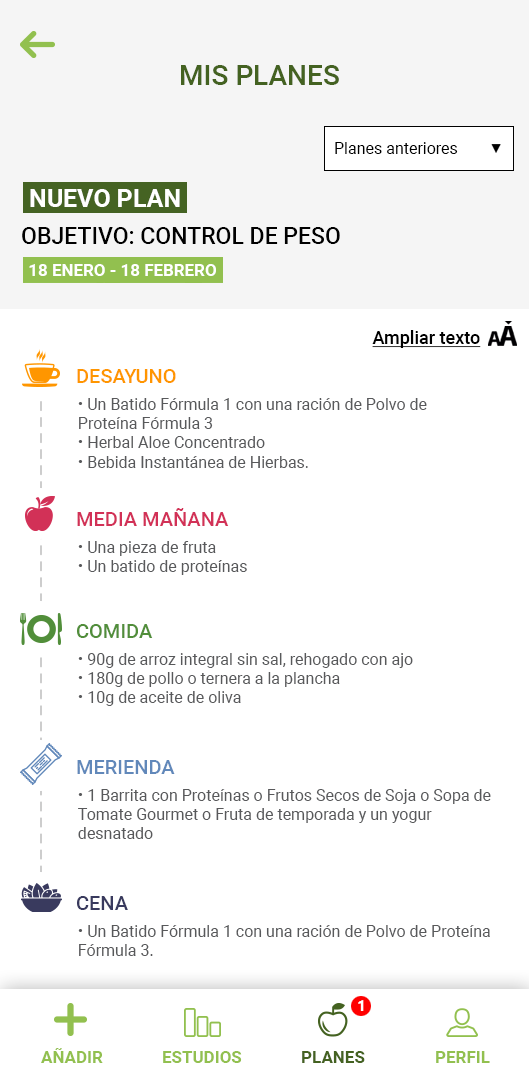
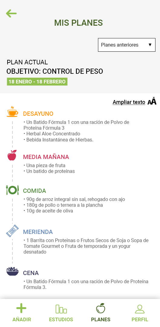
With the functionalities agreed and the user experience completed, I did all the visual design of the APP. I used a simple palette of colors which included the corporate colors and a small palette of neutral colors, together with a clear and simple iconography. Brand colors were very important for my client, so the brand colors had to predominate across the design.
LOGIN. HOME & PROFILE
add study. manually FLOW
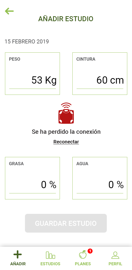
CONNECTING TANITA FLOW
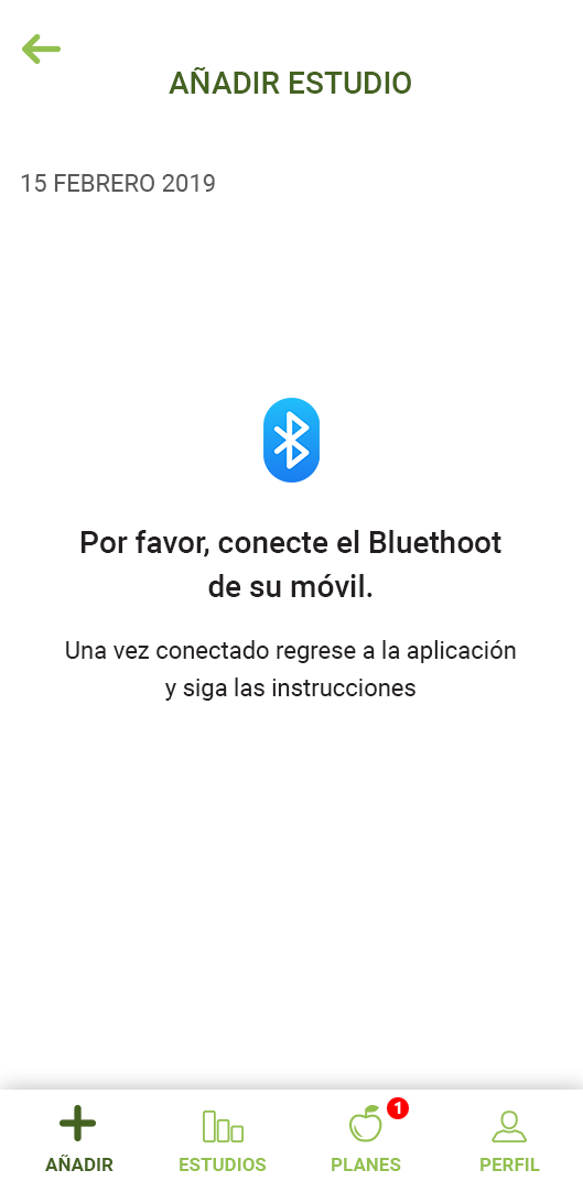
add study WITH TANITA
studies listing & study card
FOOD PLANS
Presenting the high-quality mockups to stakeholders
I built a prototype and brought the stakeholders together to present it. I ran a Sketch prototype showing stakeholders the interface design, the navigation of the app, and how the functionalities will work.
Due to stakeholders were involved during the whole process, all feedback was positive. They were happy with how the design process had been, especially the user research, the workshop, and the user testing.
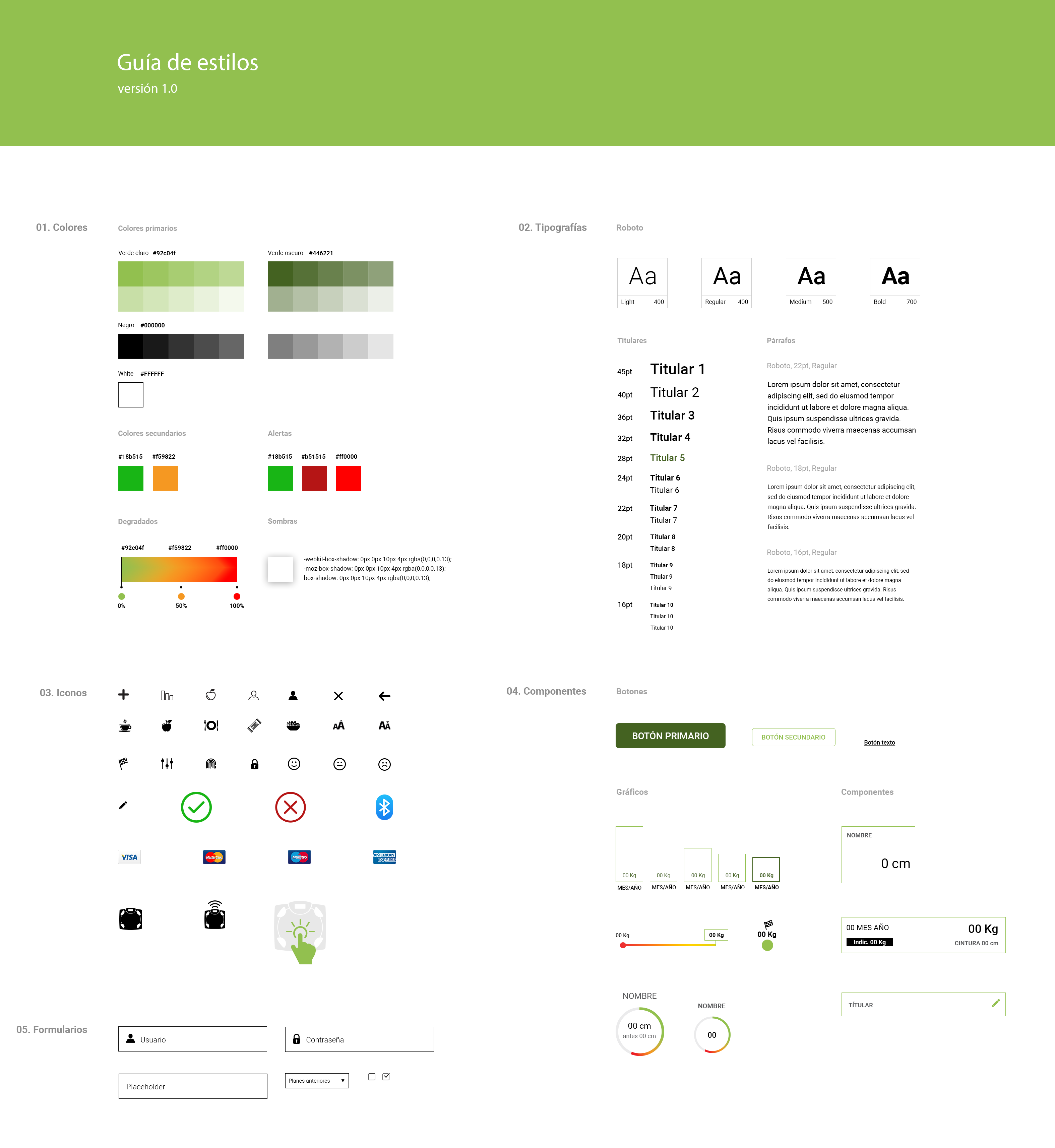
BUILDING THE DESIGN SYSTEM
With the design closed, I created the design system to make easier the development process and also to have the guidelines for future new functionalities on the APP.
REFLECTIONS AND LEARNING
This project was the perfect example that when people work as a team when all teams are involved in the project, the communication flows. Therefore, everything is easier to understand for all members of the team, it is easier being agreed on the project evolution, and allows to optimize the time of the design process getting very good results in a short time.
And also, a product based on exhaustive user research allows saving time, money and launching a successful product.
In my professional experience, this is the perfect environment to work, and the best way to get amazing results optimizing processes at maximum.
