REDESIGNING LEAD GENERATION WEBSITE
The Herbalife´s top seller in Europe, hired me to redesign his lead generation / informational website. The objective of the website is to get new customers and promote Herbalife products. Besides, this website takes part on a system where each user can have a domain name and personalize several parts of the website.
UNDERSTANDING HERBALIFE’S BUSINESS
Herbalife Nutrition is a multi-level marketing corporation that develops, promotes, and sells products related to nutrition, weight management, sports diets, and personal care.
Herbalife sells its products through independent members that they receive sales commissions from their sales or for the sales from other Herbalife’s members that they got to join the company under their networks.
Therefore, Herbalife’s members have two ways to make money, sell the product and join other people in the company as members. The main one is joining more members of the network since the network has no limit, and in this way the commissions would coming from hundreds or thousands of people, getting the head of the network to earn hundreds of thousands euros a month.

UNDERSTANDING THE PROJECT
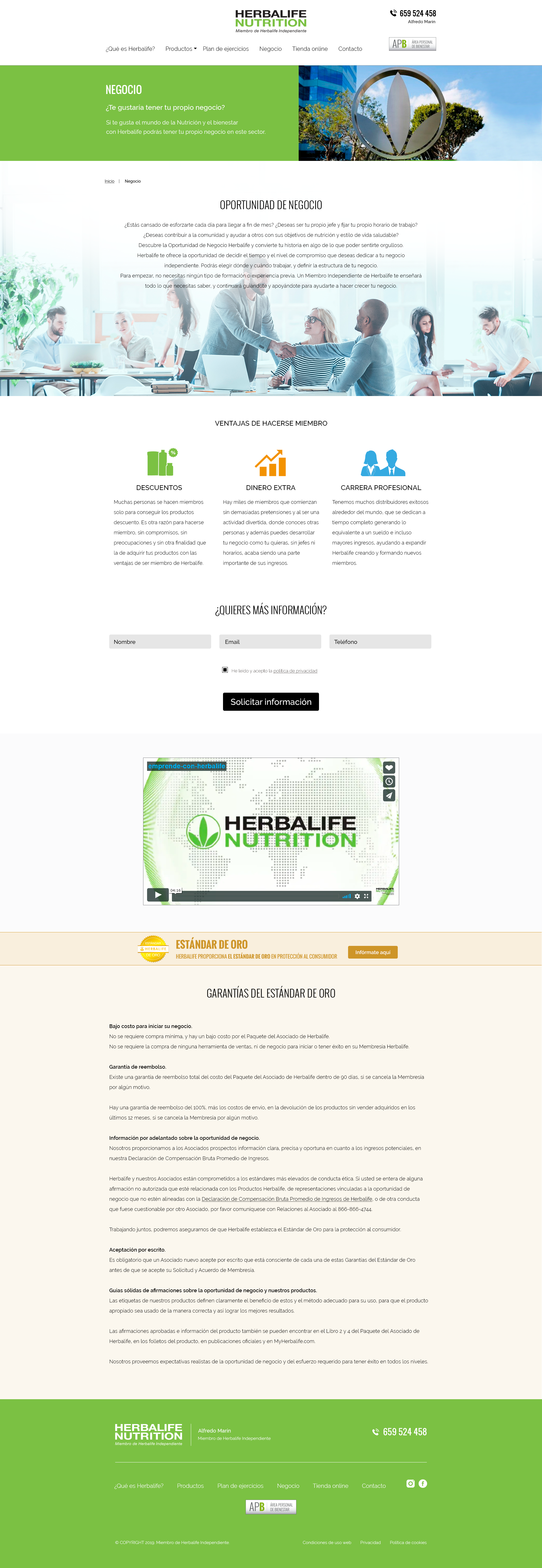
This lead generation / informational website is a tool made for the members under the network of my client so that they can grow their business selling products and joining more members to their networks and therefore, for my client's network.
His members can have this website under their domain names, and use it as a tool for lead generation and informational websites, making their online marketing strategies.
THE CHALLENGE
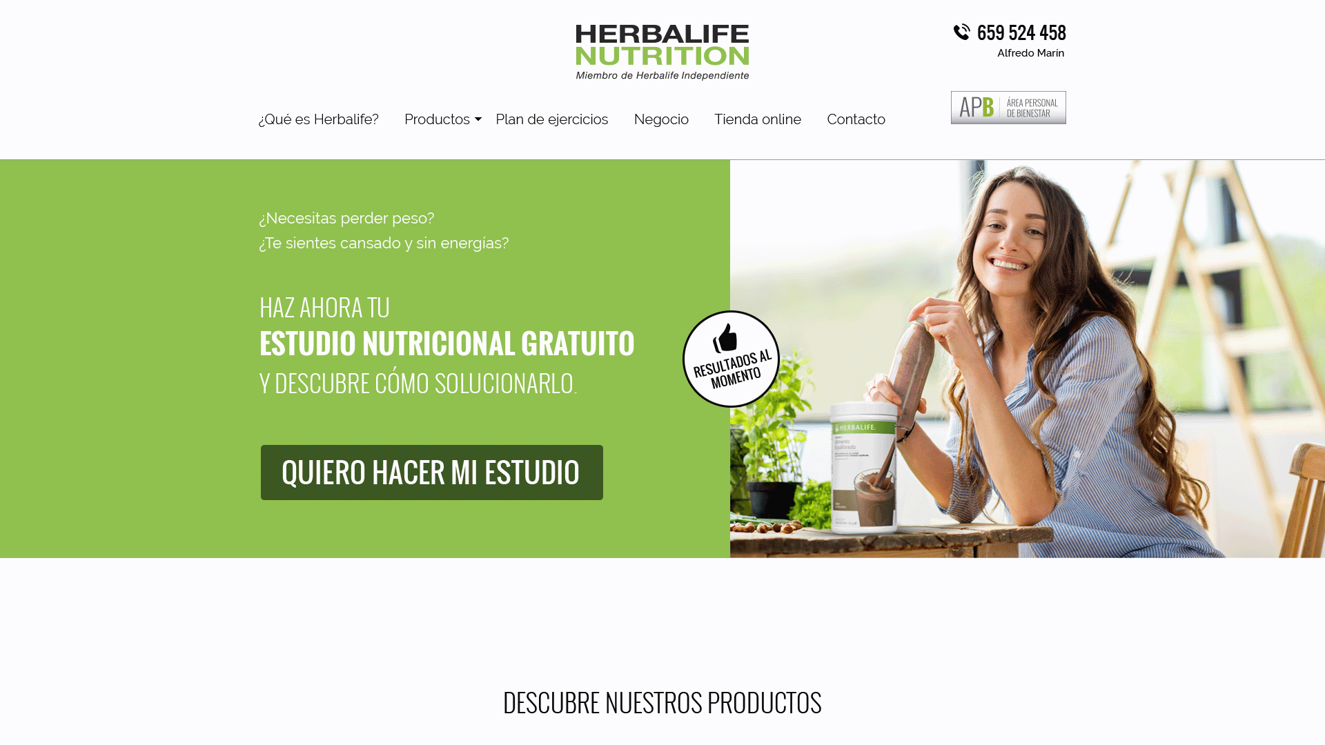
Redesigning the current website to increase the number of the customers on the system improving the conversion rate through a new approach of the free nutrition study and the website. At the same time, getting the information more user-friendly, visually understandable, and appealing to encourage users to read the information. Meeting the brand guidelines and company regulations was a mandatory requirement.
ANALYSIS, ASSUMPTIONS AND HYPOTESIS
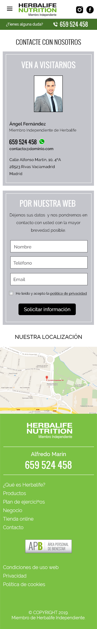
THE CURRENT DESIGN
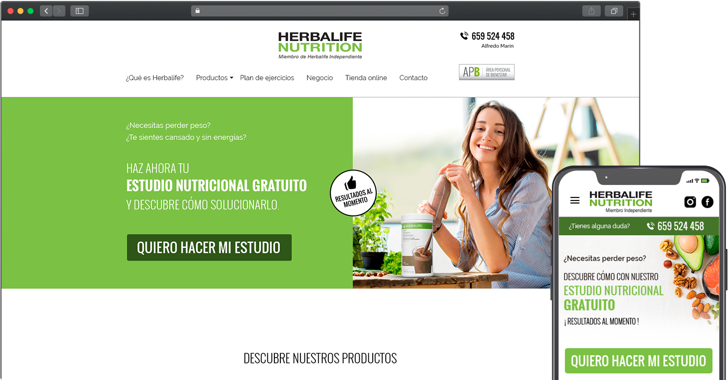
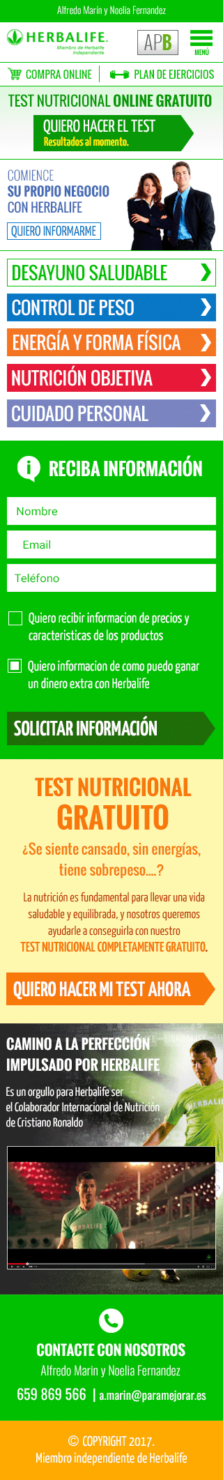
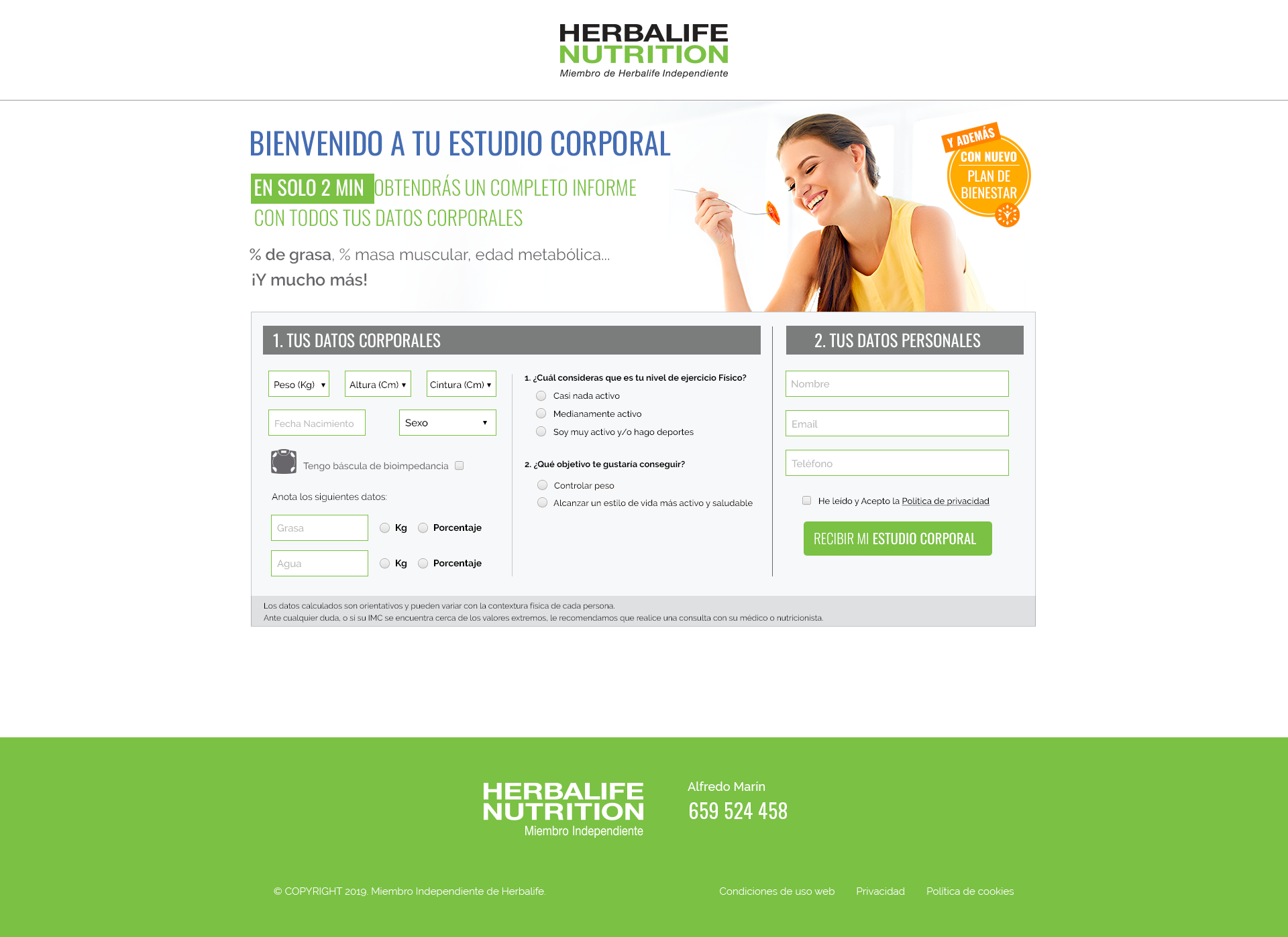
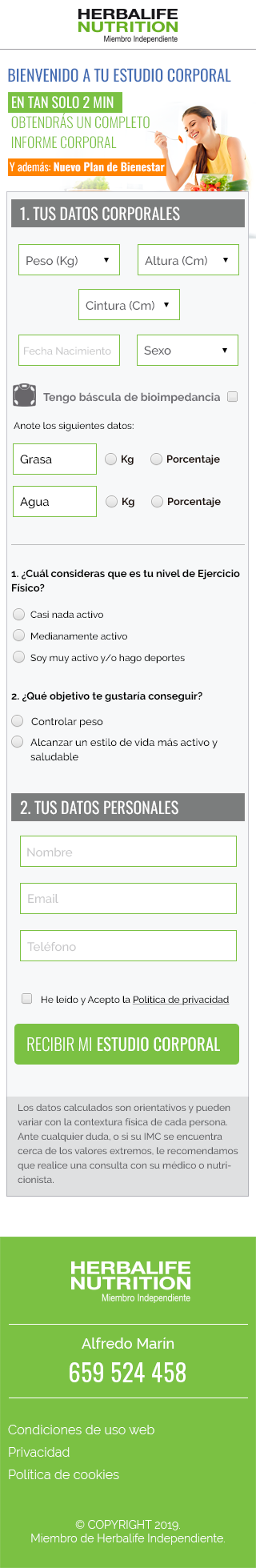
In general, the user experience and the user interface of the current website were correct. Nevertheless, the home page was the worse page in terms of user experience and user interface. It presented a high number of CTA above the fold that made it very difficult for the user met the main goal, which was for the users to do the free nutritional study, especially on the mobile version.
The main action of the website lacked enough prominence to be the heart of the business and was lost into such amount of CTAs.
On the other hand, each section of the page was very highlighted with a big contrast between them, making it difficult the understanding the content.
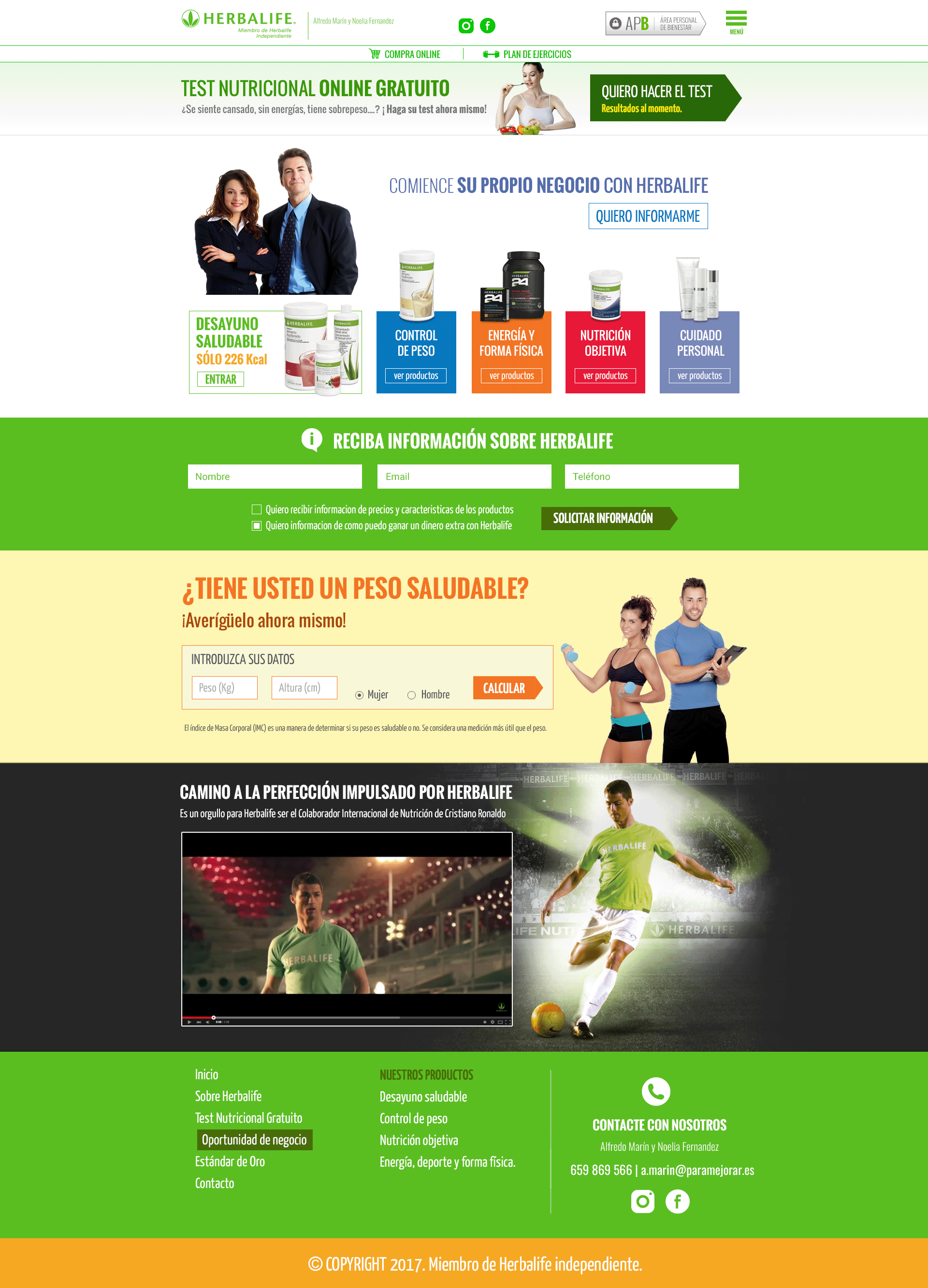
Product pages
The product pages simulated an eCommerce website, however, it didn't exist the possibility to buy the products into the website but the users were redirected to the official Herbalife website so that they could buy the products, which was not a good user experience.
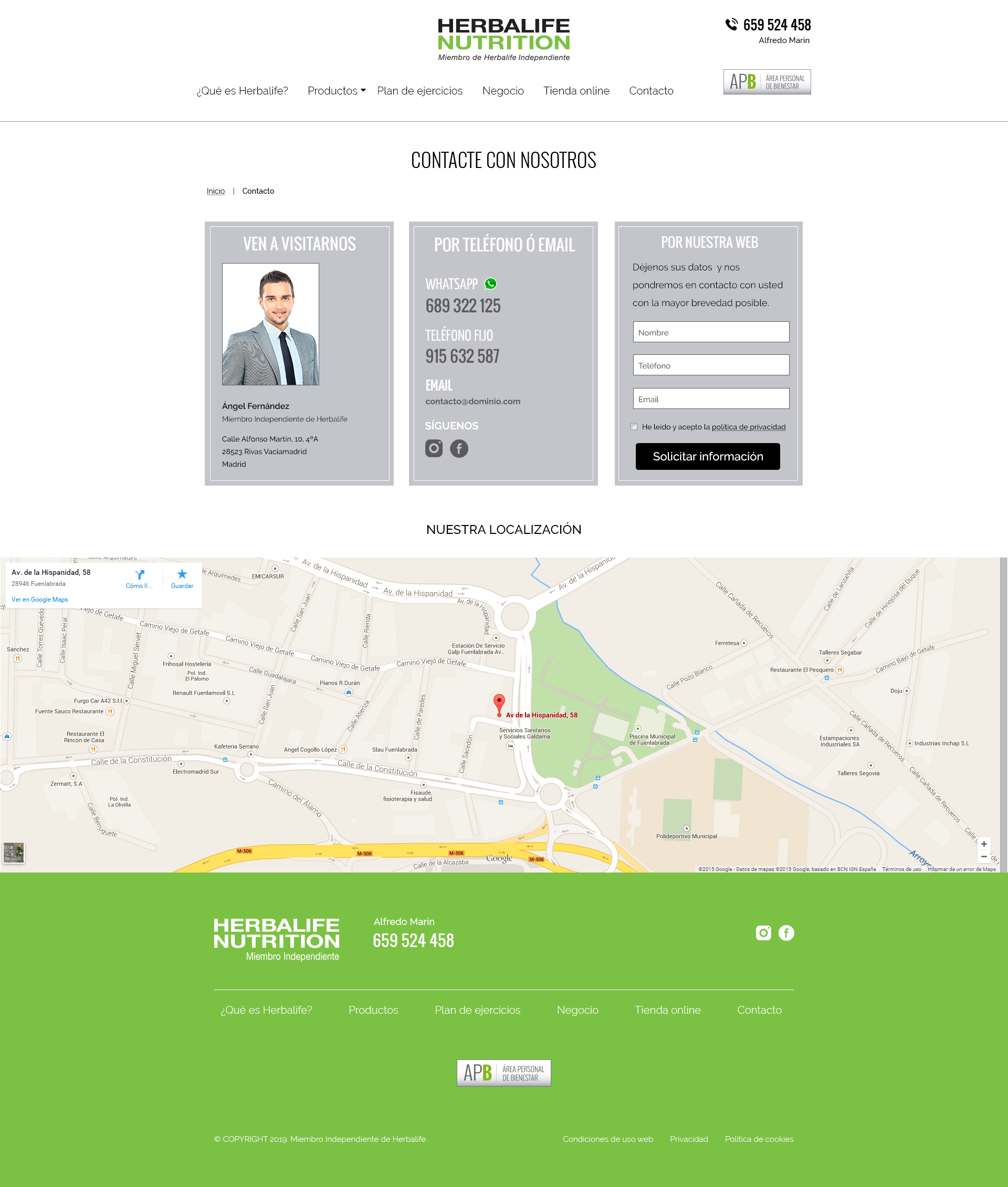
The informational pages.
The informational pages had a better balance in terms of user interface and the possible number of actions. They had a correct amount of information and they were well structured.
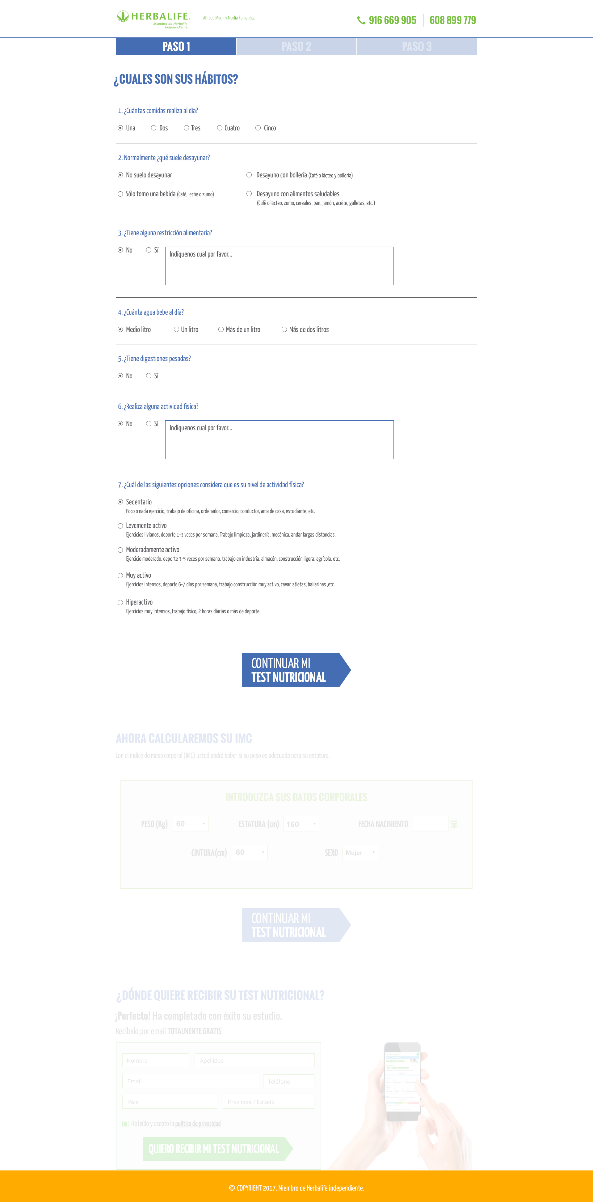
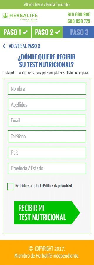
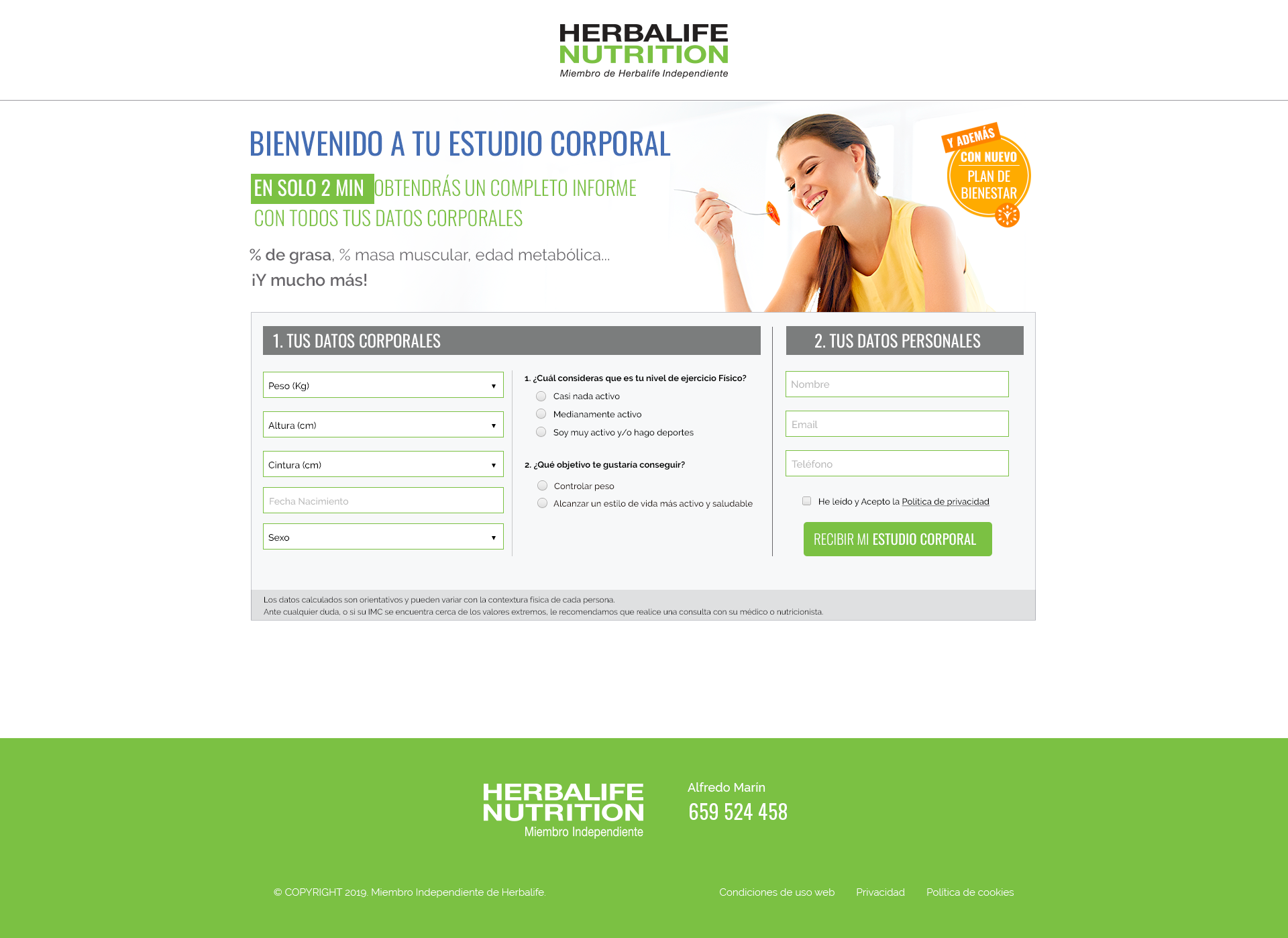
ANALYSIS OF THE CURRENT NUTRITION STUDY
The process to fill the nutritional study was very long to be a lead generation tool. It was split into 4 different steps, the first one with 8 questions, and on the following steps were 2 different forms.
To can see the following step, users had to fill in the previous one. If the users made a mistake, was not easy coming back to the previous step.
Users needed at least 5 minutes to fill up the nutritional study, which was very long to have a high conversion rate.


CONCLUSIONS
The company had not setup a conversion funnel, so I didn't have any data supporting my assumptions and help me to know clearly which parts of the process have more dropout rate.
I could see that the conversion rate was penalized due to the 2 main issues that I found. I was completely sure that the problems above the fold of the home page would be responsible for the biggest dropout rate, and afterwards, the user experience of the nutritional study.
If I would have had data to analyze the funnel, I could have tried to find the pain points into the nutritional study, and maybe don't have to completely rebuild it, saving time and money on the project.
HYPOTHESIS
Solving the 2 main issues of the current website I could improve significantly the conversion rate. On one hand, I would have to solve the usability problems on the home page above the fold, removing all the not-mandatory CTAs and putting the focus to make simple the action to start the nutritional study. On the other hand, I had to find a way to reduce the amount of data requested to the users to complete the nutritional study. I also would have to visually compress it, so that the time to fill the form wouldn't exceed 2 min.
STARTING THE RESEARCH
I had a customer database with more than 2000 people to run the research and figure out the main pain points on the website. In this business, people are high willing to collaborate in everything related to the product, since they also use it to conduct their business.
I launched a survey to the most recent system's members with some questions that allow me to validate my assumptions and hypothesis, so I focused on the home page since it was the landing page where all paid campaigns were linked, and on the nutrition study, putting special attention on it since I was completely sure that the bigger dropout rate was there.
I split the survey by device to analyze the results by device. I knew the mobile version was the worst in terms of user experience, and the results supported my assumptions.
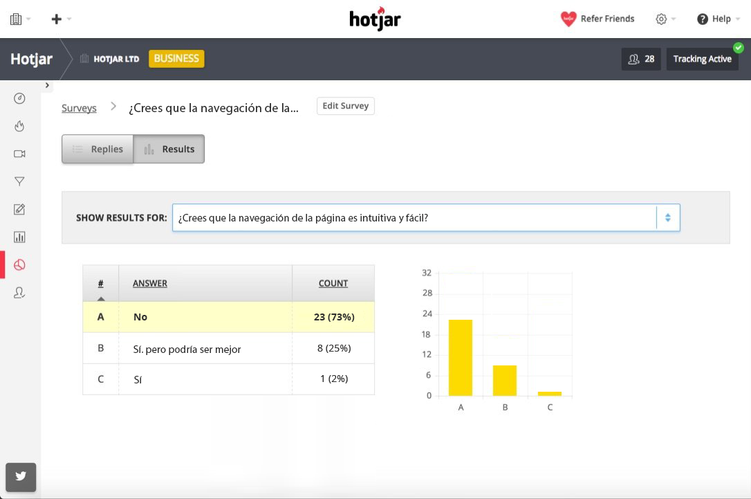
SURVEY OUTPUTS
Customers' opinion was almost the same on both devices, but on the mobile version, the participants had more problems to complete the process giving me a bigger amount of pain points.
In summary, the survey results were:
- Most of the participants thought that the process to complete the nutrition study was too long. Around 5 / 7 minutes to finish it.
- Most participants thought the nutrition study had an excessive number of worthless questions.
- Several participants thought that dividing the nutrition study into some sections was not useful.
- Most of the participants did not feel comfortable having to give their phone numbers.
- Some participants thought that navigate along the nutrition study was not intuitive and it was lack of navigational buttons.
NUTRITION STUDY
- The amount of information above the fold was too much. The carousel was taking most of the space and was not giving value.
- Most of the users thought that the main action was not clear enough. The carousel was taking too much space and the CTA to start the nutrition study could be more highlighted.
- On the mobile version, the excessive amount of information and CTA's made the main action lost into the screen, forced the users to search the CTA to start the nutrition study.
LANDING PAGE
"An important output was most the users thought that after downloading the nutrition study was not clear enough what was the following steps of the process, and this point discouraged them to continue with the service.".
CONCLUSIONS
The user answers confirmed my hypothesis about the user experience on the landing page and the process to complete the nutrition study.
I had to simplify the process that users reaching the nutritional study, and compress the nutrition study in just one step, reducing the number of questions and fields. My goal was to reduce the time to complete the test to a maximum of 2 min.
Another point that I had to check carefully was the conversion funnel and the user's flow. Most of the participants felt lost when they received the nutrition study results and they didn't were sure how to continue the process or if the process finished when they received the nutrition study. It was mandatory to improve the user's flow and getting a better strategy to convert the leads to the system's signups.
PRESENTING RESEARCH OUTPUTS TO STAKEHOLDERS
I presented to stakeholders my assumptions and hypothesis together with the user research results.
I explained to them that in general, it was completely necessary to reduce the amount of information on the website and reduce the number of questions on the nutrition study, building it in one single step. And that was the only way to increase the conversion rate.
I also explained to them that they were losing lots of high-quality leads because on the current user flow, the interested leads didn't know exactly what the next steps were, and they felt lost regarding how to know more about the service. I told them that we should have a user flow that would cover all user's cases and squeezing all the leads.
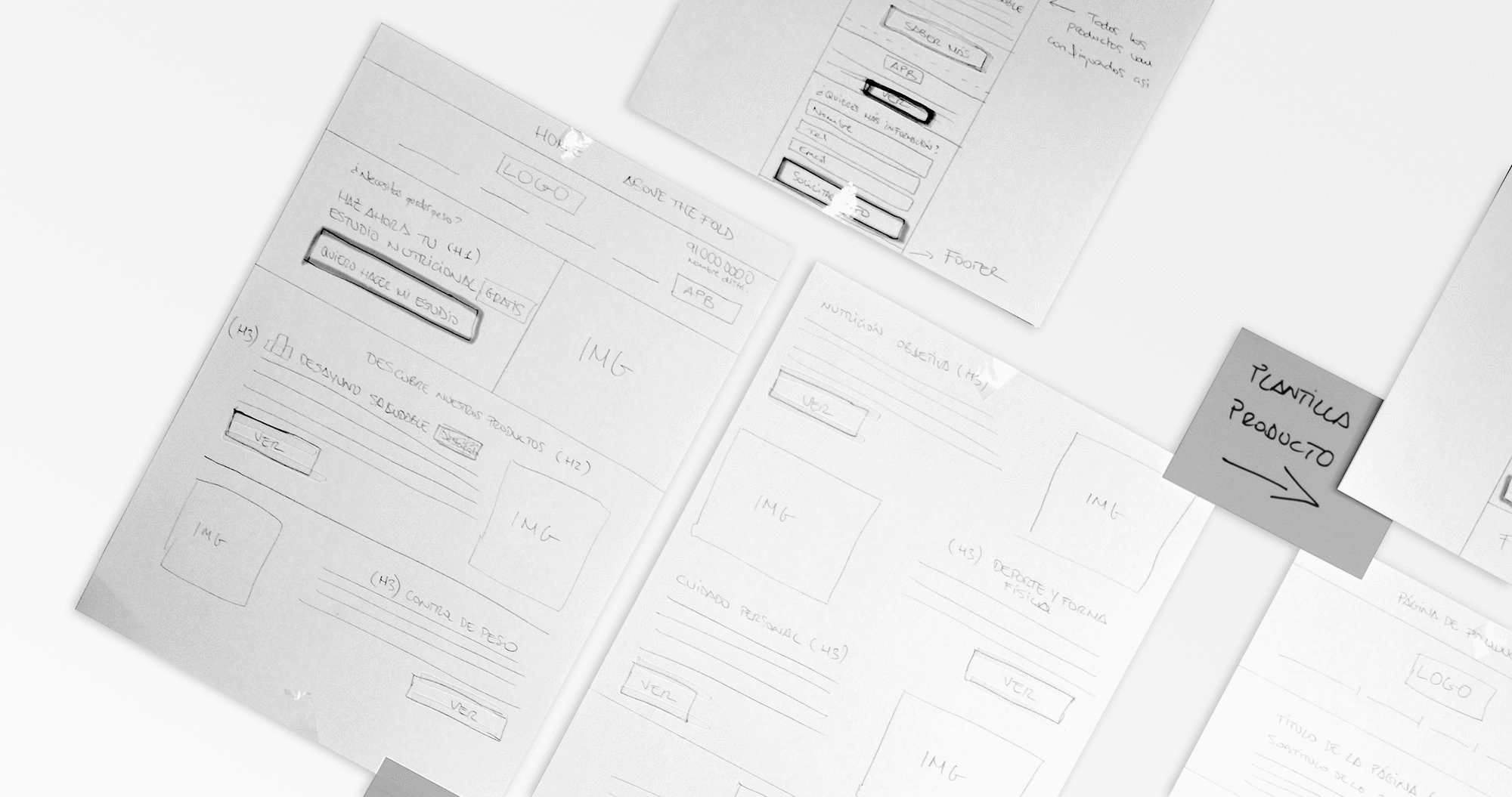
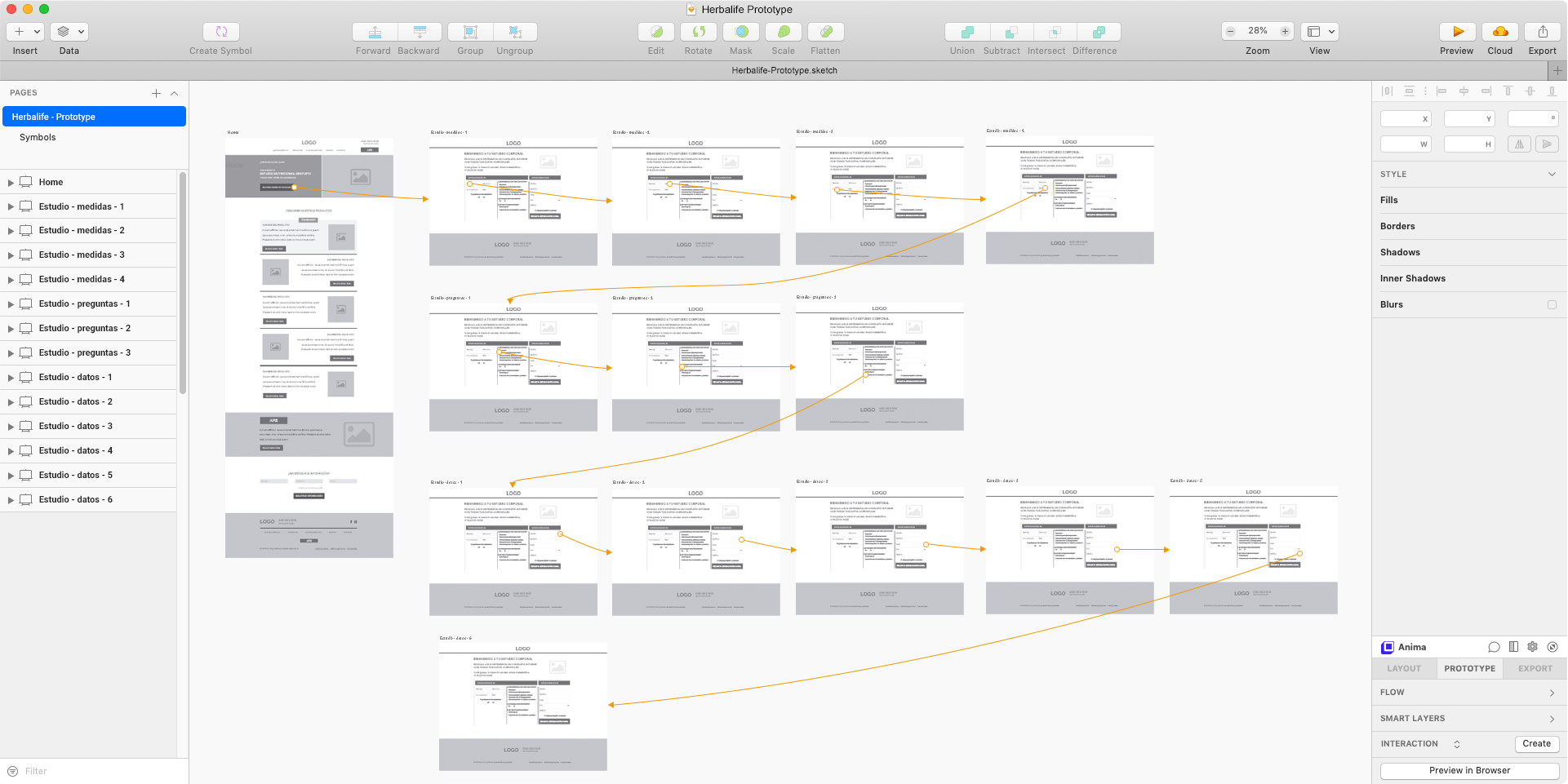
LOW-QUALITY WIREFRAMING TO PUT IN CONTEXT
I drew some wireframes to have a first approach about how will be the new home page of the website and the nutrition study in a single step, and I showed it to the stakeholders so that they were able to understand where we should reduce the information and how. They also had to give me the necessary questions to can keep the quality of the results on the nutrition study.
STAKEHOLDERS DECISION
Stakeholders agreed on the data collected from the user research and they accepted to continue the design based on the wireframes that I had presented.
MAKING THE MOST OF THE LEAD GENERATION INVESTMENT
Optimizing the conversion funnel
In order to increase the conversion rating it was mandatory to optimize the conversion funnel. The current one had too many dropout points that they had to be removed. Simplify the funnel also would imply an improvement of the user journey logic and a significant reduction of the effort to maintain and change the system when it would need.
Also, the company hadn't been doing any loyalty actions up to that point, so I added the new app as a tool to retain customers as a part of the conversion funnel.

A new customer journey
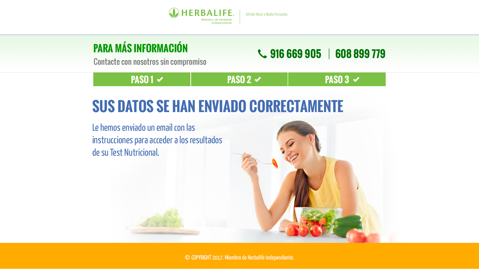
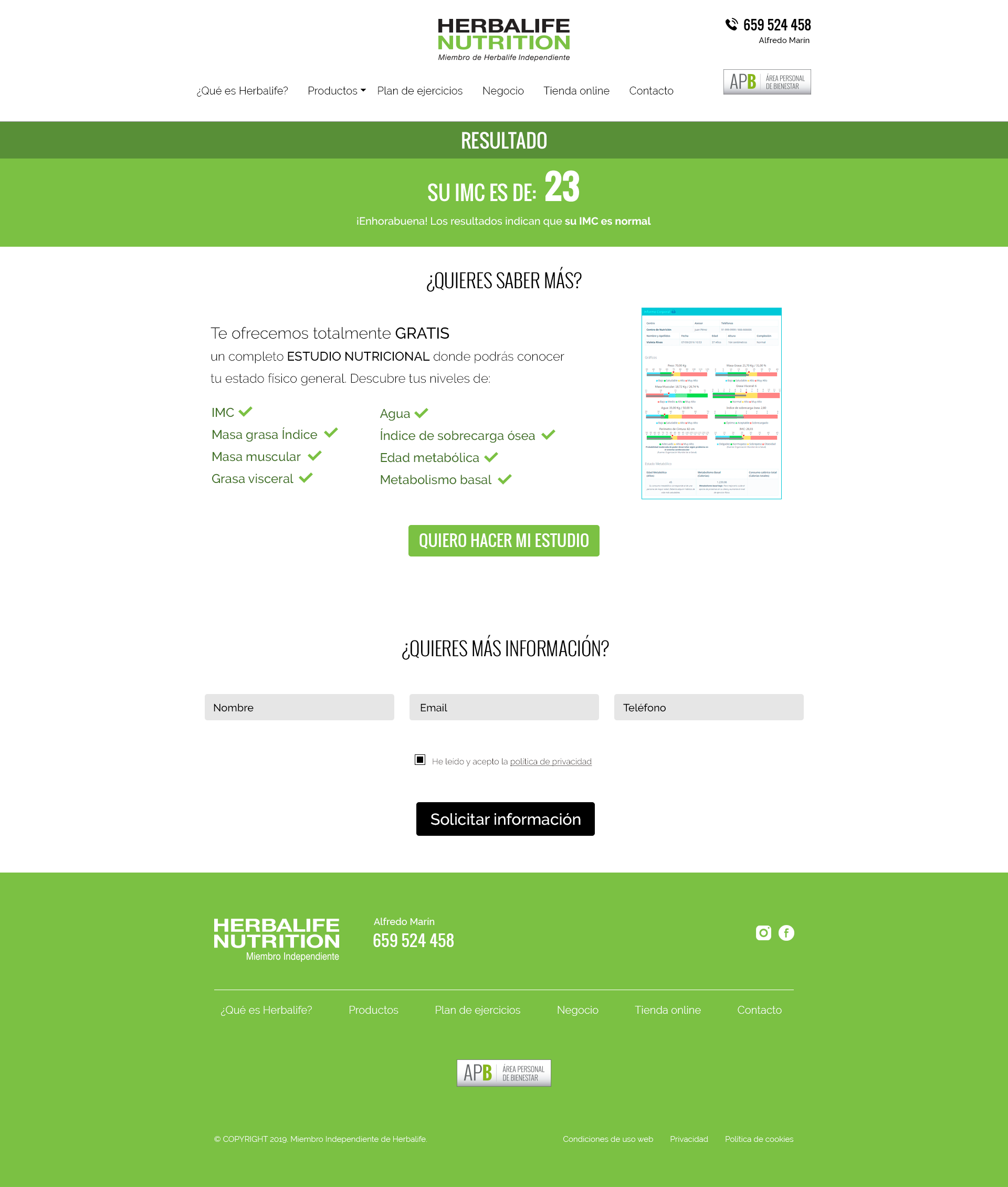
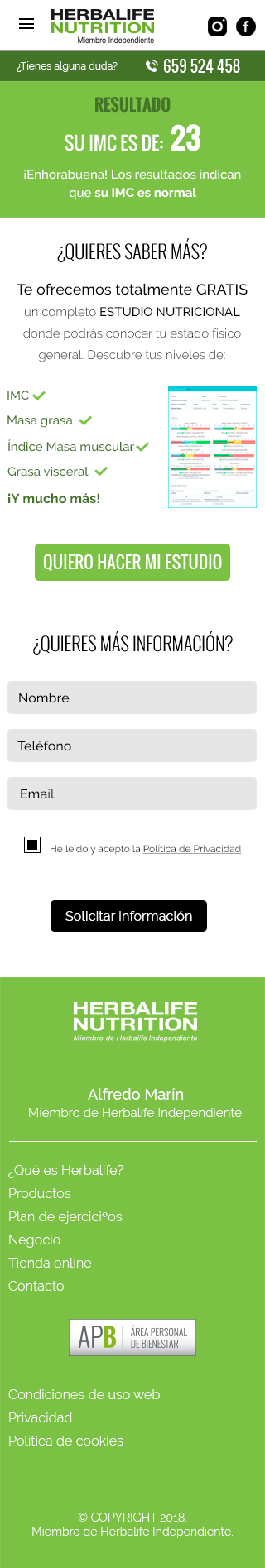
In the current customer journey, users land on the home page of the website, they fill the nutritional study form, and if they complete all the test, they see a new screen where they can download a PDF file with the nutrition study results, and the flow ends.
The conversion goal was the users registered on the company system, therefore, with this flow, the company was wasting a lot of resources to get just a few amounts of people interested to know more about the company's services and products. Also, because the PDF with the nutrition study results was very difficult to understand, and that issue discourages users to get more information.
Therefore, I changed the flow, and instead, users get the nutritional study results straight away, users would receive an email with the credentials to sign-in on the system. Automatically, they would be pre-registered on the system, and as soon as they sign-in on the system, the signup would become effective.
Once inside the system, the user would have access to see the test results on a new screen. In this screen, the user would have the possibility to arrange a free call with a nutrition expert that would explain the results and what users should do to improve them. Also, if the user closed the screen without requesting the call, I would show a modal with an urgent message, saying that they have just a certain time to get for free the call.
In this way, the company would use the resources just in people that they had a real interest to know more about the services and products.

I also created another user flows to try to decrease the dropout rate, chasing the leads more time with different communication ways and marketing techniques to try to recover them.
I suggested to them a lead management tool so that they wouldn’t have to create the user flow manually and also they could have all analytics measures on each action.
MID-QUALITY MOCKUPS
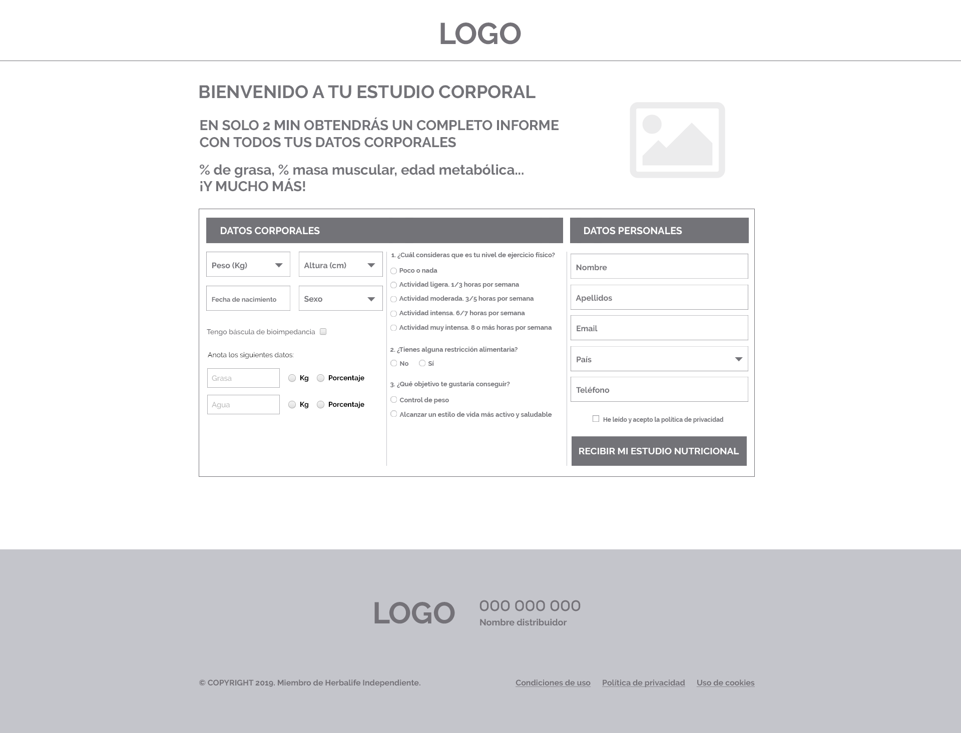
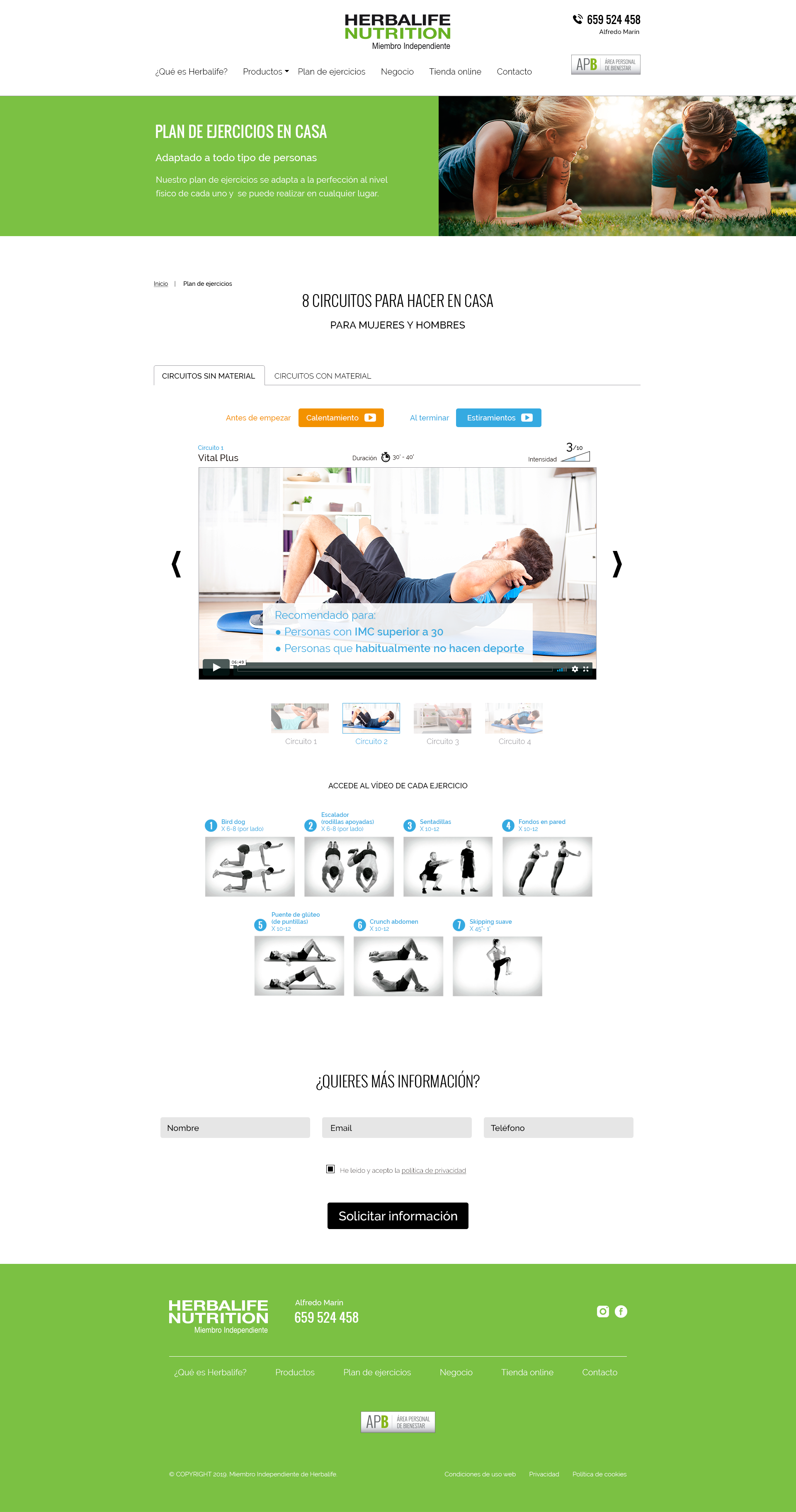
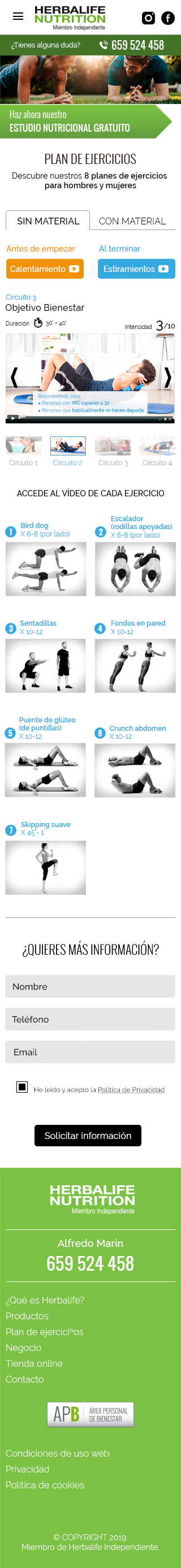
I built the mid-quality mockups based on the user research outputs. I only created the nutrition study design on a single step and the home page of the website to optimize the time to design the product.
I decided that for the informational pages were not necessary to create the mid-quality mockups since 85% of the website's use was for generating leads.
HOME
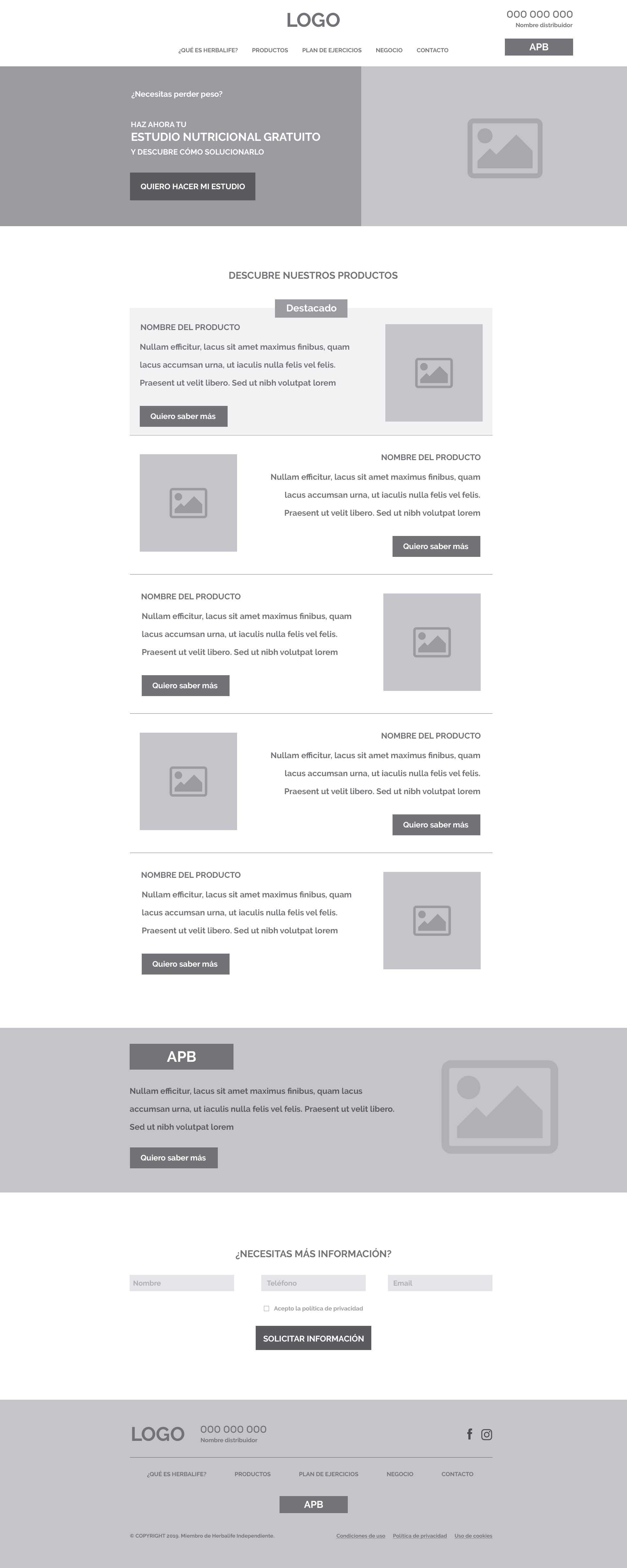
NUTRITION STUDY
HOME

NUTRITION STUDY
VALIDATING THE MID-QUALITY MOCKUPS WITH STAKEHOLDERS
I presented the mid-quality mockups to stakeholders to validate them and be agreed in continuing with the design process using those mockups to run user testing.
They found the mockups correct and they didn’t put any problem continuing with the user testing.
VALIDATING MID-QUALITY MOCKUPS WITH USERS. USER TESTING
I created Sketch prototypes to be able to conduct the user testing on the company's offices. I asked the company to recruit 10 volunteers of the system to run the user testing. In this case, it was better to have users that were more familiarized with the system and the process. I run the user testing on desktop and mobile, with five users for each test.
STABLISHING THE KEY OBJECTIVES
It was going a very simple test. I wanted to figure out mainly how easy it was to start the nutrition study, and how long time users needed to finish the nutrition study.
Despite that the stakeholders wanted to add the possibility to get the measures through connecting a Tanita scale, I disagreed to add this functionality since the main goal for the nutrition study was to get leads, and this action would take a lot of time, and therefore, the likelihood that the users leaving the nutrition study was high. To figure it out, I asked the users if they had a Tanita at home when they did the nutrition study.
Also, I wanted to know what the users thought regarding having the nutrition study on one single page if the user experience was better, and the fact that reducing the questions and the data requested made it easier to fill the form.
TEST RESULTS
- Most of the participants found the new home page much user-friendly and understandable. The access to the nutrition study was much more straightforward than before.
- Most of the participants thought that complete the nutrition study was very easy and fast. We timed how long time users needed to complete the nutrition study and the average time was between 1 minute and 1 minute and a half. However, I detected that due to the users were familiarized with the system, they jump the possibility to add the Tanita scale, and I was sure that for new users would be a pain point.
- Most of the participants found the new number of questions and data required made more sense and made it easier to collect the data. Nevertheless, they thought that the questions about health could be reduced, and the “country” input was not necessary since they didn’t do business out of Spain.
- 100% of the participants didn't use a Tanita scale to complete the nutrition study when they joined the system, and they agreed that this functionality is not useful and could be confusing.
PRESENTING THE TEST RESULTS TO STAKEHOLDERS
I presented to the stakeholders a report with the results of the test. I explained to them that the results were very good, but the participants found the Tanita scale functionality useless.
Stakeholders still thought that if the users didn't have a Tanita Scale, they just jump to the following question. And if the users had the Tanita, the results of the test would be more trustworthy.
Since they wanted to have the functionality working, I recommended to them change the action to "I have a Tanita scale" with a checkbox, instead of asking if they have a Tanita scale. And they accepted this suggestion.
I also explained that the “country” field was unnecessary for the participants, but they said that they wanted to open the marketing campaigns to other countries, since it was possible to do the business internationally; therefore I had to keep it.
NEW REQUIREMENTS
- Stakeholders requested adding to the form two optional inputs to request the Facebook and Instagram URLs. I explained to them that as more fields we had on the form, fewer possibilities to convert the leads. Also, it is very common that the people don’t remind their users’ names in the social network, therefore to fill the fields the user should go out of the website to find the user name, and in consequence, it would exist the possibility of distraction when the user would open the social network, and we would lose the lead. But they wanted to add the fields anyway and test the impact on the conversion rate.
- I had to add also a waist input in order to give more trustworthy results of the nutrition study to the customers.
BUILDING THE HIGH-QUALITY MOCKUPS
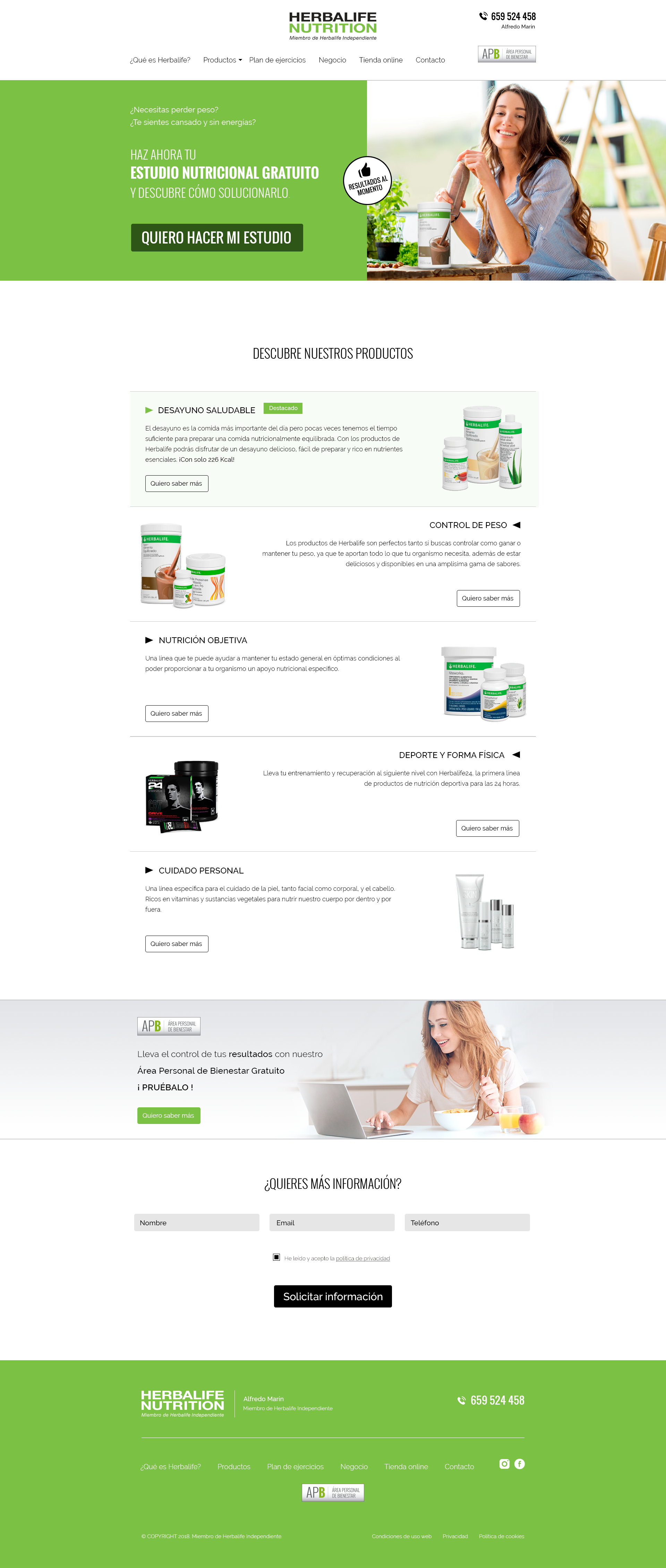
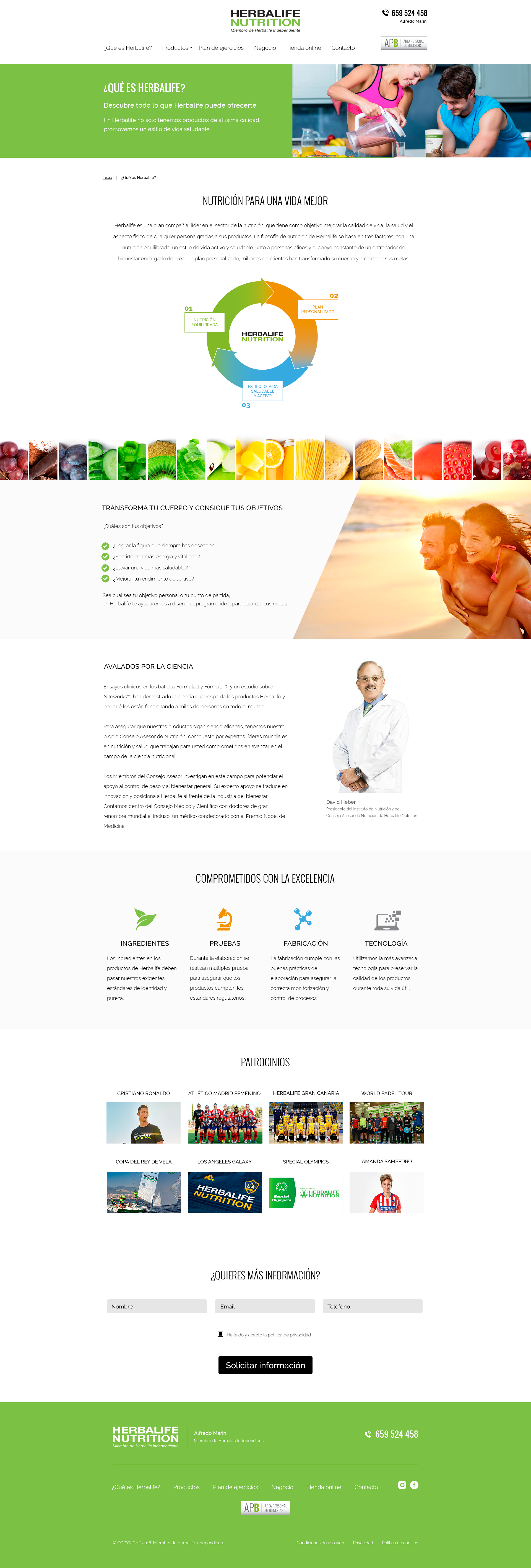
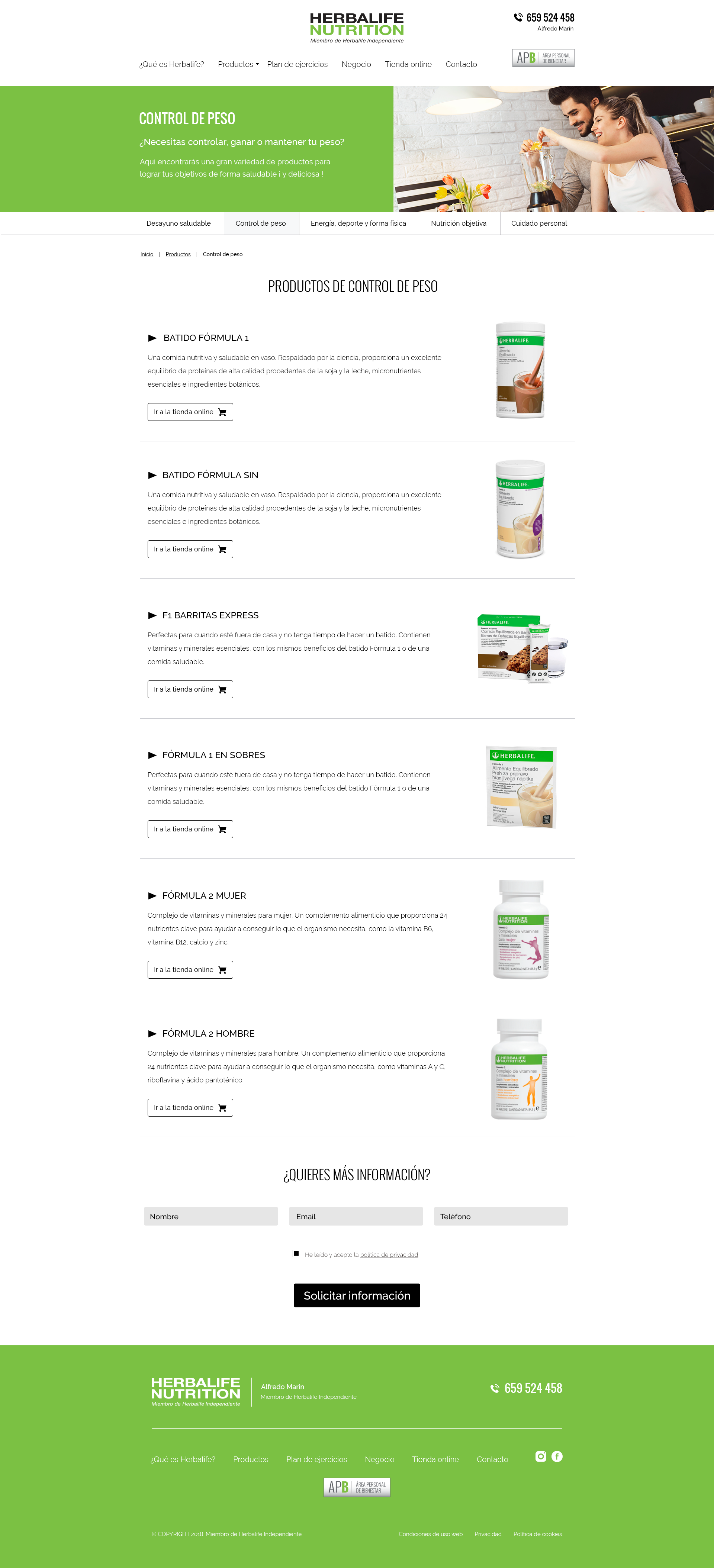
I collected the feedback from the results and the requirements from the stakeholders and I built the user interface based on them. Once again, I had to keep carefully the Herbalife's guidelines in the design as I had to do designing the APB App. I used the corporate colors together with a palette of neutral colors that would make the visual design more simple and intuitive for the user. All calls to action were put in the first person so that they would respond to the user's wishes.


PRESENTING THE HIGH-QUALITY MOCKUPS TO STAKEHOLDERS
With all screens designed on mobile and desktop devices, I presented all designs to stakeholders. They liked the simplicity of the design compared with the previous design. They agreed that the images and iconography used were in accordance with Herbalife's guidelines, and the website looked much more fresh and positive on the messages.
Stakeholders agreed that the design was closed and they give the go-ahead to build the front-end.
MEASURING THE NEW WEBSITE
With the website built, the new user flow clear and the new conversion funnel configured, we deployed on production the first version of the new website.
It was time to check the results of the new design, so we continued with the same ads campaigns on Google Facebook, and Instagram, investing the same money quantity as the months before and I compared the last month of the old website with the first month of the new website.
RESULTS
“The results after one month of testing the website were very good but, from my point of view, they could have been even better. Therefore, I suggested to the stakeholders running an A/B test to try to improve the results. They agreed with me to run the A/B test so I refined the design to can validate my assumptions.”
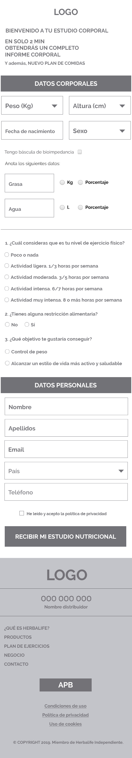
REFINING THE USER EXPERIENCE TO IMPROVE THE RESULTS
In order to improve the results, I wanted to follow the users' feedback in the mid-quality mockups user testing, removing the unnecessary inputs on the form to make it easier and faster for users to fill it out.
Following users’ feedback I did the following changes:
- Removing the possibility to allow Tanita to do the nutrition study.
- Reducing the number of health questions to two. And also reducing the number of answers to the first question.
- Removing “Country” input.
I also removed the “Surname” input since it was unnecessary.
It was not necessary to make changes to the home page (landing page of the ads). In the user testing, users didn't inform about any pain points, so I didn't change this page.
Therefore the changes were easy to do, just remove some inputs and I re-ordered the design.
CURRENT DESIGN
NEW DESIGN
CURRENT DESIGN
NEW DESIGN
INCREASING POSSIBILITIES TO CONVERT THE LEADS
In order to increase the conversion rate, I rescued from the old website a small functionality so that users can know their BMI. The functionality consisted just in adding the weight and the height, and select if you are a man or woman.
After 30 seconds of navigating on the website, if the users didn't start the nutrition study, I would show them a modal with the BMI functionality, and they would receive the results instantly on a new page where I encouraged them to get the nutrition study.
BMI MODAL
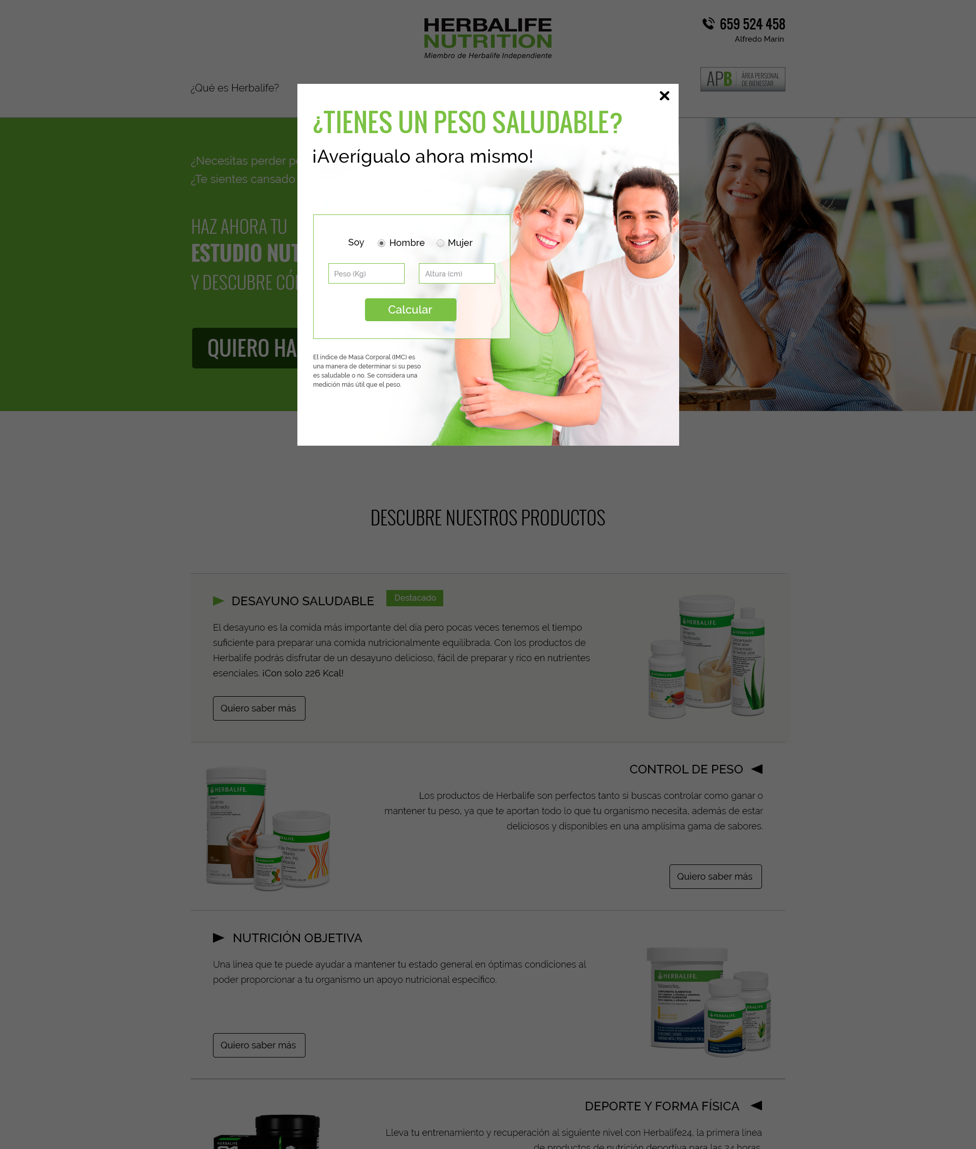
BMI LANDING
BMI MODAL
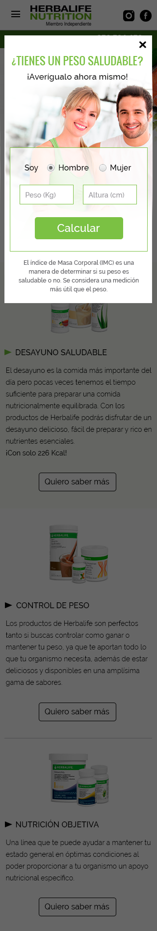
BMI LANDING
If the users still didn't start the nutrition study or they closed the BMI modal, we would show a small notification getting on the screen from the right-bottom side encouraging them to get the nutrition study.
TESTING THE REFINEMENT
To conduct this test, devs built the second option and they uploaded it in an alternative URL into the same domain, splitting the visits between the two designs. We were testing again for one month with the same campaign ads on the same platforms, measuring the results of each option.
After one month testing, we got the following results:
RESULTS
“As I thought, it was possible to improve the results, and we got getting and average results for a lead generation website. Following the new users' flows, the company could improve even more the results by chasing each lead with some marketing strategies and increasing the retention with tools like the new App.”
PRESENTING THE RESULTS TO STAKEHOLDERS
I presented the results to the stakeholders showing them that to get a better conversion rate and increase the lead generation, the best way to do it is always simplifying as much as possible the entrance of data removing unnecessary inputs and questions.
They were very happy with the results, but despite that no converted lead used the Tanita to do the nutrition study, they wanted to move backward and again add the possibility to do the nutrition study throughout the Tanita.
The data showed that it was a useless functionality, but due to the investment that the company did to develop the functionality, they wanted to keep it.
NUTRITION STUDY FORM FINAL DESIGN
Following the stakeholder's request, I re-designed the “corporal data” area coming back to the first design and mixing it with the new design.
REFLECTIONS AND LEARNING
As it was the first project with this company, we did good work thanks for the teamwork. At every moment all teams were involved in all stages of the project, therefore the communication flowed and it was very easy to build a new website that supposed a big improvement for the company in terms of business.
Regarding the decision to keep the possibility to do the nutrition study with a Tanita scale because to develop this functionality costed time and money, I think it was a mistake. Sometimes companies invest money on ideas that in the end doesn't work and it is not a reason to keep something that is not working.
However, I couldn't collect specific data that supported the fact the possibility to can do the nutrition study with a Tanita scale was supposed to a detriment to the conversion rate.
I always say that nowadays, if it is convenient, we have to make decisions based on users' feedback and data. Maybe I was wrong and this functionality wasn't detracting from the conversion. In conclusion, validate always your assumptions base on data